


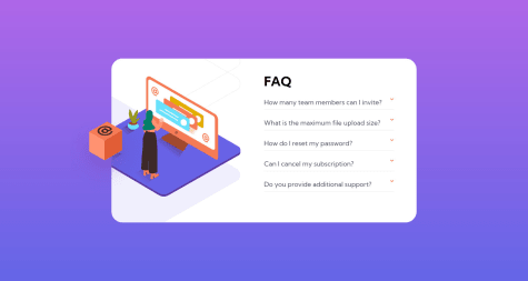
@DewanshakibSubmitted about 2 years ago
Latest comments
- @lidiakrajewskaPosted about 2 years ago
Hi! Great desktop view! I've got a few suggestions to make mobile and tablet view better.
- I'd change the media querry 375px to something around 500px, as it covers various mobile screens sizes that are in use (now the layout breaks on e.g iPhone XR which is 414px)
- Instead of setting body's height, it's a good practice to set min-height (that way your wrapper element has the room to grow and the content won'y overflow on smaller devices). The same applies to .wrapper height.
- It would look good if you'd add also margin-bottom to .accordian-wrapper
Marked as helpful0 - @Nuel-EnejiSubmitted over 2 years ago@lidiakrajewskaPosted over 2 years ago
Hello! Great job on the card's look :) I've got a few tips on how to make it more responsive. Right now if you change the font size in your browser to bigger, the card breaks (there's an overflow). It's caused by giving the card a fixed height. It's recommended to use min-height instead. But because you use absolute positioning the card will stretch then, so I'd suggest to use Flexbox to position the card instead.
body {
display: flex;
min-height: 100vh;
}
0 - @AhmedFawzi44Submitted almost 3 years ago@lidiakrajewskaPosted almost 3 years ago
Good job!
I noticed that on mobile the component is not centered perfectly. It's caused by the attribution div. You can take attribution div outside of the container and add to body styles:
body {
  flex-direction: column;
  align-items: center;
}
This should solve the issue. Also you can wrap your container div in <main> tag (it'll solve the accessibility issue) :)
Marked as helpful0 - @kingkeveySubmitted almost 3 years ago@lidiakrajewskaPosted almost 3 years ago
Great job, that's a very elegant solution!
To solve the accessibility issues you can wrap your card div in <main> tag and change your h2 to h1 and h3 to h2 :)
Marked as helpful0 - @victorsonetSubmitted almost 3 years ago@lidiakrajewskaPosted almost 3 years ago
Hi! You did a great job, it looks very similar and the code seems logical.
But I've got a suggestion about media queries. As a general rule it's good to have as little media queries as possible, because it makes the code easier to maintain. Ussually no more than 3 media queries is needed. Actually you can build this one without any! :) You can try out this code:
.wrap {
  width: min(87%, 400px);
}
On small screens it will has the width of 87%, but once that 87% will get bigger than 400px it won't grow anymore. That way your component will look great even on big screens. (Now it stretches on 2K monitor).
Marked as helpful2 - @JideoteticSubmitted almost 3 years ago@lidiakrajewskaPosted almost 3 years ago
Hello! Good job!
I've got one suggestion - as best practice try to avoid fixed heights. Try using min-height / max-height instead, it will allow each component to resize if needed and will prevent overflow, so overall will make your web pages more responsive.
0