
Submitted over 2 years ago
HTML,CSS,SASS And Vanila JavaScript.
#accessibility

@Dewanshakib
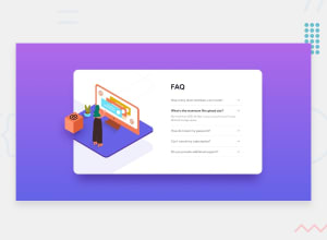
Design comparison
SolutionDesign

Solution retrospective
Any feedback is warmly welcome.
Community feedback
- @lidiakrajewskaPosted over 2 years ago
Hi! Great desktop view! I've got a few suggestions to make mobile and tablet view better.
- I'd change the media querry 375px to something around 500px, as it covers various mobile screens sizes that are in use (now the layout breaks on e.g iPhone XR which is 414px)
- Instead of setting body's height, it's a good practice to set min-height (that way your wrapper element has the room to grow and the content won'y overflow on smaller devices). The same applies to .wrapper height.
- It would look good if you'd add also margin-bottom to .accordian-wrapper
Marked as helpful0

Please log in to post a comment
Log in with GitHub
Join our Discord community
Join thousands of Frontend Mentor community members taking the challenges, sharing resources, helping each other, and chatting about all things front-end!
Join our Discord