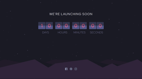
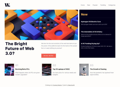
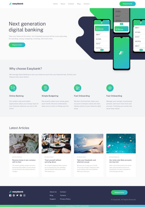
I was able to make the tricky and quite complicated flip animation, and I improvise by separating the tens and ones section and i will improve the style next time
Josh Javier
@joshjavierAll comments
- @thomasshelbyyySubmitted 7 months agoWhat are you most proud of, and what would you do differently next time?@joshjavierPosted 7 months ago
Your implementation of the countdown is really neat. You could look into refactoring this into a web component, say
<countdown-timer>
, to encapsulate the logic in a single file that you can easily reuse in other projects.In terms of accessibility, your social links in the footer doesn't have an accessible label, so I recommend adding an
aria-label
attribute in your<a>
tags, or using any of the techniques in the article Accessible Icon Buttons. Make sure to addaria-hidden="true
in your SVGs as well.Anyway, once you improve the style, your solution would be perfect. Cheers!
Marked as helpful1 - @mandriva19Submitted over 1 year agoWhat are you most proud of, and what would you do differently next time?
...
@joshjavierPosted over 1 year agoHello fellow 11ty fan 😁
Awesome work on this solution! If you want to gain a deeper understanding of 11ty's features, I suggest checking out the course Learn Eleventy From Scratch. It's a bit outdated, but it still teaches solid principles on how to structure project files (partials, data, etc.) and accessibility.
Happy coding, my friend!
Marked as helpful1 - @ananfitoSubmitted over 1 year ago
Aside from advice about best practices, I have one question in mind for this project:
How to adjust the active state of the
button
for mobile?I noticed when I viewed the live version on my mobile device, after clicking the button to generate a new piece of advice, the "glow" effect around the button remained in affect. In other words, it did not reset to the normal button. There was still a neon green
box-shadow
on the button.I'm sure I need to adjust the media query or something to fix this. Any help would be appreciated. Thank you.
@joshjavierPosted over 1 year agoHello Anthony! I got curious myself and I found this: Solving Sticky Hover States with @media (hover: hover)
tl;dr You have to move the hover style in a media query so it will only get applied to devices that have hover capability.
To preserve the glow effect when we actually tap the button on mobile, we need to add a rule that applies the same style to the
:active
state:.btn:active { box-shadow: 0 0 25px 1px var(--neon-green); } @media (hover: hover) { .btn:hover { box-shadow: 0 0 25px 1px var(--neon-green); } }
Hope it helps :)
Marked as helpful1 - @mandriva19Submitted over 1 year agoWhat are you most proud of, and what would you do differently next time?
...
@joshjavierPosted over 1 year agoHello @mandriva19!
First off, the layout looks really great on mobile. But when I switch to my desktop (I have a 1920x1200 monitor) there are white gaps on the side as shown here: https://ibb.co/J5ymzh9
In this particular case, you can easily fix this by removing the
max-width
rules in your main wrapper. But usually, the common pattern is to have a.wrapper
div inside each of the sections whose sole responsibility is to center the content and limit its width. The background rules will stay on the parent tags unaffected by the wrapper, so the background can stretch to either side of the page. I used this pattern in my Workit landing page solution if you need a reference. :)Nice job on making your code well-structured and very readable. One CSS tip I recommend is using logical properties to make your code more DRY. For example:
padding-top: var(--spacing-20); padding-bottom: var(--spacing-20); /*↓*/ padding-block: var(--spacing-20); /* Also works for margins! */ margin-left: auto; margin-right: auto; /*↓*/ margin-inline: auto;
Hope that helps, happy coding!
Marked as helpful1 - @diazrainierSubmitted over 1 year ago
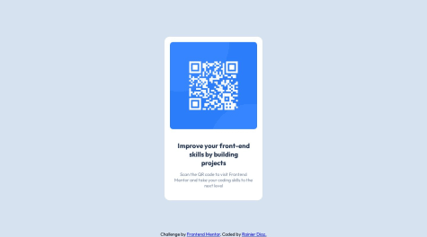
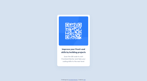
Hey guys! This is my solution for the QR code component project and I would really appreciate your feedback or suggestion on how I should tackle this component. I created this project in the most simple manner to get familiarize with the fundamentals of HTML and CSS. Let me know on how I could have execute this better using good coding practices, thanks!
@joshjavierPosted over 1 year agoHello Rain 👋
First of all, congrats on submitting your first solution! You're off to a good start; the layout looks good on both mobile and desktop, and your code is well-structured and readable.
Some ideas on what you could improve:
-
Use semantic HTML tags to improve accessibility and help with SEO. For example, you can put the container div inside a
<main>
tag and the attribution div inside a<footer>
tag. -
I also recommend adding an H1 because it tells search engines and screen readers what your page is about. In this case, the H1 can be
<h1>QR code component</h1>
. You can use a.visually-hidden
utility class to add the H1 without showing it visually so your code remains accessible without deviating from the design.
Hope it helps, happy coding!
Marked as helpful0 -
- @jefflangtechSubmitted over 1 year ago
I used the CSS property clip-path like so:
clip-path: ellipse(60% 55% at 50% 45%);
to create the curves at the bottom of the hero and main sections. Any other ideas of ways to do that? It reminded me of making an layering shapes in the canvas, so it wasn't totally out there, but also not as easy as I anticipated.
And what about grid vs flexbox for the numbered cards section? If I did it again I'd probably used grid to have more control over the layout but I ended up sticking with flex even though at some screen widths it does things I don't like as much.
@joshjavierPosted over 1 year agoHello Jeff 👋
I think using
clip-path
is a clever way to implement the curve dividers. Another approach is to use inline SVG, which is what I did in my solution. Both approaches look similar, although the "div with clip-path" uses less markup, so I might try this in a future solution ;)As for using grid vs flexbox in the numbered cards section, I think either is fine for this particular layout. Personally I used flexbox as well. I did notice some overflow in the tablet view (https://ibb.co/wWp1w3H), which can be fixed by adjusting the position of the pseudo-element:
.card-title::before { /* ... */ left: 4rem; // from -1rem }
Hope that helps, happy coding!
Marked as helpful0 - @MrNikaaSubmitted over 1 year ago
First of all, I struggled to make the card type of background and there is something that I have no idea how to fix when I uploaded the project it worked fine on all of my devices PC and Redmi Note 8 pro but then I Sent it to my brother and my friend both using an iPhone and the button would be at the bottom of the page on both devices so if anyone has any idea on how to fix this I would appreciate it. Thanks! (I also tested it using googles responsive tool and it worked there but not on the actual device.)
@joshjavierPosted over 1 year agoHello @MrNikaa! I checked your solution on my iPhone SE and indeed the button is placed at the bottom edge of the screen. To fix this, you can position the button relative to the card like this:
.card { position: relative; } .roll-button { position: absolute; bottom: 0; left: 50%; transform: translate(-50%, 50%); /* Remove the margin-bottom */ }
You can remove the
.roll-container
which is adding a huge gap at the bottom half of the card. https://ibb.co/HC8Mv8LAlso, I noticed that you used a lot of media queries to adjust the font size and spacing of multiple elements. In general, avoid doing this as it makes your app more difficult to maintain and debug. Start with a mobile-first approach, and then only add breakpoints when your design "breaks".
For example, you can avoid setting fixed
width
andheight
in multiple breakpoints if you only set amax-width
in your card, like this:.card { max-width: 40em; margin-inline: 1em; /* Add side margins on smaller screens */ padding-bottom: 4em; /* Add enough space to separate the button from the divider */ }
Last tip: the
alt
attribute doesn't always have to be a description of the image. If the image is used for decorative purposes only (like the visual divider), thealt
attribute should be empty. If the image has a specific function (like the button), then thealt
attribute should describe the function of the image, e.g.alt="Generate new advice"
. For more info, I recommend checking out Alt-texts: The Ultimate Guide and the W3C alt Decision Tree.Hope it helps, happy coding!
Marked as helpful1 - @diaasaurSubmitted about 2 years ago
Is it alright to position the level 1 heading offscreen so that page contains a level-one heading?
@joshjavierPosted over 1 year agoHello dia!
I know you submitted this solution 9 months ago, but I'd like to give my take on your question on whether it's alright to position the H1 off-screen.
I saw your answer to Hyron's comment, and your idea of not using H1 for the card heading is valid. H1 is used to describe the page as a whole - in this case, the page is not about "Improve your front-end skills by building projects" but about a "QR code component". So I think you made the right call here. :)
In terms of accessibility, nice job using an
.offscreen
utility class to hide the text for sighted users, but keep it accessible to screen readers. It's similar in function to the CSS pattern.visually-hidden
, which is commonly used for accessibility purposes.Also, I suggest removing the
figcaption
element because it's redundant with the alt text of theimg
element. The.offscreen
class only hides an element visually, so screen readers might repeat the phrase "QR code" more than once, which is not pleasant for the user. You can also remove thefigure
wrapper as well, but that's up to you.Hope I was able to add some value. Happy coding!
Marked as helpful1 - @Nix7amcmSubmitted over 1 year ago@joshjavierPosted over 1 year ago
Hello NixyMc! 👋
Good job on your solution. Your markup is organized and easy to read from a developer's POV. I see you used BEM for classes and CSS custom properties, which definitely helps with code maintainability. 💯
In terms of keyboard accessibility, I think the social links at the footer can be improved. I'm able to see the correct active state when I hover over the icons, but not when I press the Tab key to cycle through them. This is because you added the hover animation to the icon inside the link, which is not an interactive element. When using the Tab key, the
<a>
element is being focused, but not the icon inside of it. You can fix this by adding the.social__link
selector to your hover styles.For example (a bit wordy, but it works):
.social__link:hover .social__link__icon, .social__link:hover .social__link__icon::after, .social__link:focus-visible .social__link__icon, .social__link:focus-visible .social__link__icon::after { color: var(--icon-hov); border-color: var(--icon-hov); }
Even better, I recommend checking Sara Soueidan's article on Accessible Icon Buttons for a better implementation you can apply to your projects.
Hope it helps, happy coding!
Marked as helpful1 - @CarlTheBeginnerSubmitted over 2 years ago@joshjavierPosted over 2 years ago
Hi Carl!
Good job on your solution. The code for both your HTML and CSS files are well-structured and very readable. I like how you split element attributes into individual lines, which makes it easier to find and change them later on.
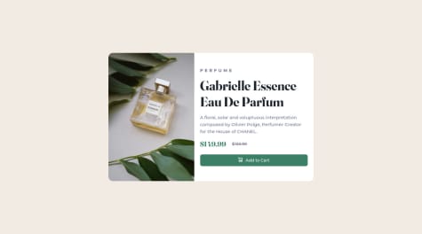
In terms of semantics, consider replacing your
<div class="main-content">
with a<main>
element. This should fix the accessibility issues in your solution's report, which you should definitely check out.For your Add to Cart button, consider using a
button
tag. It can be tricky when deciding between buttons vs. links, but in general you should try to use<a>
tags when you want to send the user to a different page, and<button>
tags to trigger an action -- like adding an item to the shopping cart. I think you also forgot to add active/hover styles for the button.The
<i>
wrapper for your icon is unnecessary -- you can remove it. And since your button already has the "Add to Cart" text, the cart icon can be considered as a decorative image. Thus, you should use an empty alt text for the cart icon to follow web accessibility best practices.In terms of layout, the desktop view looks good. For mobile, I noticed the card is overflowing vertically because you set
height: 100vh
on yourdiv.main-content
element. In general, avoid usingheight
and usemin-height: 100vh
instead to fix the responsiveness.Happy coding!
Marked as helpful1 - @adram3l3chSubmitted over 2 years ago
Feedbacks will be appreciated :)
@joshjavierPosted over 2 years agoHi Adarsh!
Nice work on your solution. I really like the subtle hover transition you added to the Add to Cart button. :)
In terms of accessibility, I noticed that you filled in a value for the button icon's alt text. This is repetitive since the button already contains actual text ("Add to Cart"). You can fix this by using an empty alt text (
alt=""
), which is the best practice according to WCAG. This should also fix the accessibility issue in your solution's report.I also noticed that the card gets cut on mobile view because you set a
height
to the<body>
element. You can replace this rule withmin-height: 100vh
so that the body element can expand beyond 100vh when the content can't fit. You can also add apadding
of 1-2em to the<body>
element to give the card a little more breathing room.Happy coding!
Marked as helpful4 - @Gabriel4PFSubmitted over 2 years ago
This is my first frontend Mentor project, I am trying to solidfy my knowledge of HTML and CSS, by doing more Practical Projects, I had a little bit of a hard time trying to resize the image properly for the different screen sizes.
I am relatively satisfied with how the Card responds to different sizes, If you have any feedback on what I can do to improve or any comments please feel free and let me know
@joshjavierPosted over 2 years agoHi Gabriel! :)
Nice work on your solution. I like that you used descriptive names for classes, which makes the code more readable.
Syntax-wise, your HTML is okay. You can improve this by using HTML5 semantic tags, e.g., you can use
<main>
instead of<div class="wrapper">
which is more descriptive (and also solves the accessibility issues that show up in your solution's report).For the image, your solution of using two
<img>
tags and hiding one depending on the viewport size works fine. As an alternative, I recommend looking into the<picture>
element, which allows you to specify multiple versions/sizes of an image for different screen sizes. This way, you don't have to write additional media queries. You can check out my solution to see how I implemented it.In terms of accessibility, good job adding descriptive alt text to the main images. However, I noticed you also added alt text to the cart icon in the button. It's actually best practice to use an empty alt text attribute for images that are purely decorative, which applies in this case since there's already a text in the button that says "Add to Cart". In fact, screen readers would read this as "cart icon Add to Cart, button" which is repetitive. You can use an empty alt text for the cart icon so that screen readers will read it as "Add to Cart, button" which is better. :)
Happy coding!
Marked as helpful0