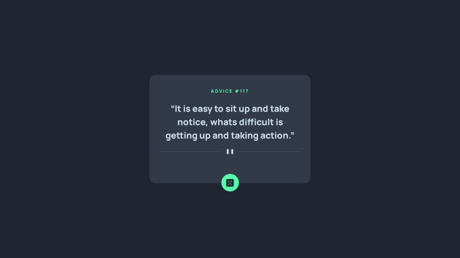
Responsive Advice Generator using Flexbox
Design comparison
Solution retrospective
First of all, I struggled to make the card type of background and there is something that I have no idea how to fix when I uploaded the project it worked fine on all of my devices PC and Redmi Note 8 pro but then I Sent it to my brother and my friend both using an iPhone and the button would be at the bottom of the page on both devices so if anyone has any idea on how to fix this I would appreciate it. Thanks! (I also tested it using googles responsive tool and it worked there but not on the actual device.)
Community feedback
- @joshjavierPosted almost 2 years ago
Hello @MrNikaa! I checked your solution on my iPhone SE and indeed the button is placed at the bottom edge of the screen. To fix this, you can position the button relative to the card like this:
.card {
position: relative;
}

.roll-button {
position: absolute;
bottom: 0;
left: 50%;
transform: translate(-50%, 50%);
/* Remove the margin-bottom */
}
You can remove the
.roll-containerwhich is adding a huge gap at the bottom half of the card. https://ibb.co/HC8Mv8LAlso, I noticed that you used a lot of media queries to adjust the font size and spacing of multiple elements. In general, avoid doing this as it makes your app more difficult to maintain and debug. Start with a mobile-first approach, and then only add breakpoints when your design "breaks".
For example, you can avoid setting fixed
widthandheightin multiple breakpoints if you only set amax-widthin your card, like this:.card { max-width: 40em; margin-inline: 1em; /* Add side margins on smaller screens */ padding-bottom: 4em; /* Add enough space to separate the button from the divider */ }Last tip: the
altattribute doesn't always have to be a description of the image. If the image is used for decorative purposes only (like the visual divider), thealtattribute should be empty. If the image has a specific function (like the button), then thealtattribute should describe the function of the image, e.g.alt="Generate new advice". For more info, I recommend checking out Alt-texts: The Ultimate Guide and the W3C alt Decision Tree.Hope it helps, happy coding!
Marked as helpful1
Please log in to post a comment
Log in with GitHubJoin our Discord community
Join thousands of Frontend Mentor community members taking the challenges, sharing resources, helping each other, and chatting about all things front-end!
Join our Discord
