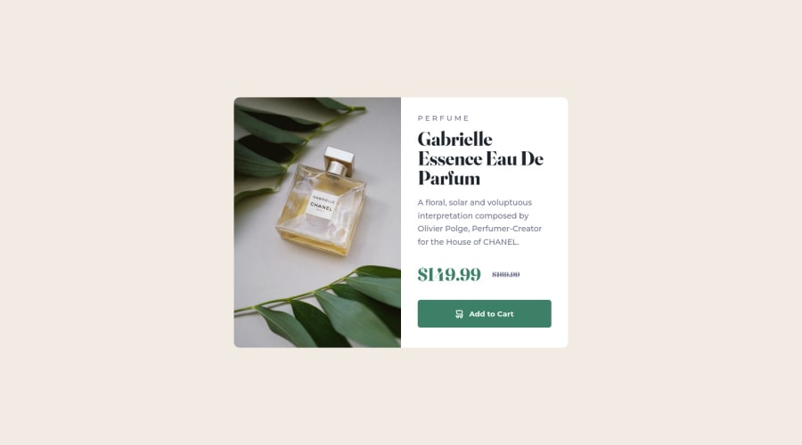
Response Card Component page made using CSS and HTML


Design comparison

Solution retrospective
This is my first frontend Mentor project, I am trying to solidfy my knowledge of HTML and CSS, by doing more Practical Projects, I had a little bit of a hard time trying to resize the image properly for the different screen sizes.
I am relatively satisfied with how the Card responds to different sizes, If you have any feedback on what I can do to improve or any comments please feel free and let me know
Community feedback
- @joshjavierPosted over 2 years ago
Hi Gabriel! :)
Nice work on your solution. I like that you used descriptive names for classes, which makes the code more readable.
Syntax-wise, your HTML is okay. You can improve this by using HTML5 semantic tags, e.g., you can use
<main>instead of<div class="wrapper">which is more descriptive (and also solves the accessibility issues that show up in your solution's report).For the image, your solution of using two
<img>tags and hiding one depending on the viewport size works fine. As an alternative, I recommend looking into the<picture>element, which allows you to specify multiple versions/sizes of an image for different screen sizes. This way, you don't have to write additional media queries. You can check out my solution to see how I implemented it.In terms of accessibility, good job adding descriptive alt text to the main images. However, I noticed you also added alt text to the cart icon in the button. It's actually best practice to use an empty alt text attribute for images that are purely decorative, which applies in this case since there's already a text in the button that says "Add to Cart". In fact, screen readers would read this as "cart icon Add to Cart, button" which is repetitive. You can use an empty alt text for the cart icon so that screen readers will read it as "Add to Cart, button" which is better. :)
Happy coding!
Marked as helpful0@Gabriel4PFPosted over 2 years ago@joshjavier I see what you are saying, great explanation I actually did not think that's how it would be read to the screen readers. I wont forget Thank you
0 - @mubizzyPosted over 2 years ago
Excellent job on this challenge! your report has a few issues though:
- wrap everything in your body in
<main>or use semantics
2. it is a best practice to use both HTML 5 and ARIA landmarks to ensure all content is contained within a navigational region.
Hope it helps:)...don't forget to mark it as helpful 👍
You can get more details here...click here
0@Gabriel4PFPosted over 2 years ago@mubizzy Thank you so much, Yeah i eventually realized that I should have used main instead, I will make sure to be aware of semantics going forward
0@mubizzyPosted over 2 years ago@Gabriel4PF am glad 😊 😃 my post helped
Happy coding 😃 😊 😀
0 - wrap everything in your body in
- @AgusSaMacPosted over 2 years ago
Hello Gabriel, congratulations for finishing this challenge, here's some feedback:
. When using tags on html try and avoid using div unless there's no other option. you used one at the very beginning a
<main>tag would be better. See https://www.w3schools.com/html/html5_semantic_elements.asp for more info.- On your CSS file you use too many tags at the beggining. I suggest you use normalize.css to achieve the same result.
- Also many tags have their properties modified, but they arent used in the html. If you don't use them, don't bother with them. It will keep you code cleaner that way.
- When the card is in a mobile screen size it isn't centered. Use
justify-content: centerin your media query for the wrapper class. - Try and apply the mobile first approach. Then just use media queries to modify them for other sizes.
- I suggest you use several media queries, try and avoid writing all that code together, it would be easier to maintain and read afterwards if you have the queries separated by their class.
..container { } @media (max-width: 500px) { }- Lastly, remember to keep you indentation.
I really hope it is helpful,
0@Gabriel4PFPosted over 2 years ago@AgusSaMac Thank you so much for taking your time for detailed feedback. I had thought it would be nice to add the CSS reset to reset the browser default settings but I see it made the code very chunky so I would refrain from that going forward.
0


Please log in to post a comment
Log in with GitHub
Join our Discord community
Join thousands of Frontend Mentor community members taking the challenges, sharing resources, helping each other, and chatting about all things front-end!
Join our Discord