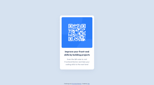
Design comparison
Solution retrospective
Is it alright to position the level 1 heading offscreen so that page contains a level-one heading?
Community feedback
- @joshjavierPosted over 1 year ago
Hello dia!
I know you submitted this solution 9 months ago, but I'd like to give my take on your question on whether it's alright to position the H1 off-screen.
I saw your answer to Hyron's comment, and your idea of not using H1 for the card heading is valid. H1 is used to describe the page as a whole - in this case, the page is not about "Improve your front-end skills by building projects" but about a "QR code component". So I think you made the right call here. :)
In terms of accessibility, nice job using an
.offscreen
utility class to hide the text for sighted users, but keep it accessible to screen readers. It's similar in function to the CSS pattern.visually-hidden
, which is commonly used for accessibility purposes.Also, I suggest removing the
figcaption
element because it's redundant with the alt text of theimg
element. The.offscreen
class only hides an element visually, so screen readers might repeat the phrase "QR code" more than once, which is not pleasant for the user. You can also remove thefigure
wrapper as well, but that's up to you.Hope I was able to add some value. Happy coding!
Marked as helpful1 - @correlucasPosted about 2 years ago
👾Hello Dia, congratulations for your new solution!
❓ Answering your question:
1.Every page needs a main heading, the
<h1>
to shows which is the most important heading. You need to increase the headings ever by one level, like h1, h2, h3 to show the titles hierarchy.Some tips:
2.You’ve used
<div>
to wrap the card container, in this case you need to use<main>
since this is the main block of this page.3.the html structure can be reduced by removing unnecessary divs, all you need is a single
<main>
or<div>
to keep all the content inside, and nothing more. The ideal structure is thediv
and only the image, heading and paragraph.Here’s a minimal html structure for this challenge:
<body> <main> <img> <h1></h1> <p></p> </main> </body>
✌️ I hope this helps you and happy coding!
1 - @hyrongennikePosted about 2 years ago
Hi @diaasaur,
is there a specific reason you why you want to do that? why not make the heading a h1 the link you provided basically explains why it's crucial to have a h1 on your page.
1@diaasaurPosted about 2 years ago@hyrongennike hey nike! I’m new to writing semantic html and I thought articles (made the card using an article) semantically should have h2 - h6 headings and any h1 heading should be in the top-level of html. Didn't know where I got that idea from, that's why I ended up making h1 offscreen - tinkered around a lil bit and turns out I was misguided.
0@hyrongennikePosted about 2 years ago@diaasaur Oh I see no you basically go from top to bottom to the page decreasing the heading if it make sense. I get why you got confused though because it's a self contained component you thought of it as being part of a larger project hence the use of the h2 totally understandable but nice job on the challenge this think of all the challenges as separate "websites".
Marked as helpful1
Please log in to post a comment
Log in with GitHubJoin our Discord community
Join thousands of Frontend Mentor community members taking the challenges, sharing resources, helping each other, and chatting about all things front-end!
Join our Discord