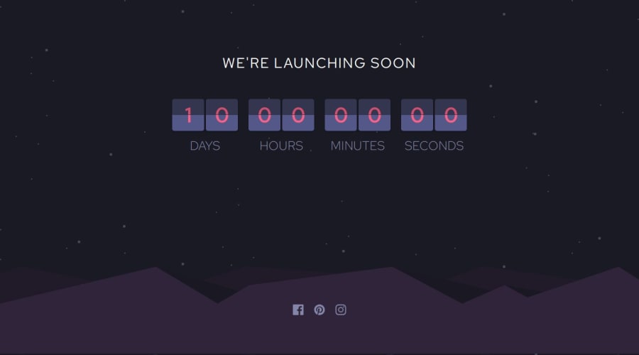
Design comparison
Solution retrospective
I was able to make the tricky and quite complicated flip animation, and I improvise by separating the tens and ones section and i will improve the style next time
Community feedback
- @joshjavierPosted 11 months ago
Your implementation of the countdown is really neat. You could look into refactoring this into a web component, say
<countdown-timer>, to encapsulate the logic in a single file that you can easily reuse in other projects.In terms of accessibility, your social links in the footer doesn't have an accessible label, so I recommend adding an
aria-labelattribute in your<a>tags, or using any of the techniques in the article Accessible Icon Buttons. Make sure to addaria-hidden="truein your SVGs as well.Anyway, once you improve the style, your solution would be perfect. Cheers!
Marked as helpful1
Please log in to post a comment
Log in with GitHubJoin our Discord community
Join thousands of Frontend Mentor community members taking the challenges, sharing resources, helping each other, and chatting about all things front-end!
Join our Discord
