


@sanjv12Submitted 26 days ago
Latest solutions
- Submitted about 1 month ago
Responsive blog preview card
- HTML
- CSS
I wonder if it's right to use the property
aspect-ratioin this case. Does it have some effect on the images? For example:.author-avatar { width: 3.2rem; height: 3.2rem; max-width: 64px; max-height: 65px; aspect-ratio: 64 / 65; }I'd appreciate any feedback about this. Thanks!
- Submitted 4 months ago
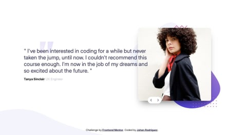
Coding bootcamp testimonials slider with some accessibility
#accessibility#animation- HTML
- CSS
- JS
Latest comments
- @jdrodriguez2707Posted 26 days ago
Hi, @sanjv12. I hope you're doing great.
First of all, your solution is good. You copied the structure and the styles of the design well. But there are some details you should check out to improve the solution. For example the container size, which looks stretch when the screen resizes. To solve this, you could remove the
width: 40vwso the container can resize according to the screen size. Also, remember to set a max-width (like max-width: 750px) so the container doesn't grow more than necessary and looks more similar to the desktop design.On the other hand, you can do the same thing with the recipe image. You just need to remove the height property and the image will resize according to the container size. Lastly, don't forget to choose the right colors (you can find them in the style-guide.md file) but if you feel more comfortable with your own color palette, it's okay.
That's it. I hope this help you. Best of luck!
0 - @rukhulkiromSubmitted about 1 month agoWhat are you most proud of, and what would you do differently next time?
I’m most proud of how clean and well-structured the code is, making it easy to read and maintain. The dark theme with contrasting green accents creates a visually appealing and modern look. Using Flexbox ensures proper alignment and responsiveness, while the smooth hover effects on the social media links enhance user interaction.
Next time, I would introduce CSS variables for colors and avoid redundant styling by grouping common properties. These improvements would make the project more scalable, user-friendly, and easier to update in the future.
What challenges did you encounter, and how did you overcome them?One of the challenges I encountered was ensuring that the card design remained responsive across different screen sizes. Initially, the card looked great on larger screens, but on smaller devices, some elements felt cramped. To overcome this, I used flexbox to center the content properly.
Another challenge was making the social media links visually appealing while maintaining good accessibility. At first, the hover effect didn’t stand out enough. I refined the styling by adding a background color change and a slight contrast shift, ensuring better user interaction.
What specific areas of your project would you like help with?-
Responsiveness & Mobile Optimization – The design looks good on larger screens, but I want to ensure it adapts well to all devices. Are there better CSS techniques I can use to improve responsiveness, especially for very small screens?
-
Hover & Focus States – I added hover effects to make the buttons more interactive. Do they feel intuitive, or are there improvements I could make to enhance the user experience further?
-
Code Optimization – I tried to keep my CSS clean, but I feel there might be redundant styles. Are there any ways I can refactor my CSS to make it more efficient and scalable, perhaps using CSS variables or utility classes?
@jdrodriguez2707Posted about 1 month agoHi, @rukhulkirom. I hope you're doing great! Your solution looks really good, you replicated the design very well. Also, I really liked that you used
<ul>and<li>elements for the social links list. I actually incorporated them into my own solution thanks to you!Here are some tips I can give you according to your requests:
-
About the responsiveness & mobile optimization, the design looks great on all devices! However, you might consider adding some horizontal padding to ensure proper spacing around the card on smaller screens.
-
Another thing to improve is the measurement units you used. Instead of px, consider using rem for better adaptability to different user font sizes. This ensures that your website remains accessible and scales properly. I recommend this article for a deeper understanding.
-
You could also add transitions so the hover effects look more fluid, for example:
.social-media ul li a {
  display: inline-block;
  width: 100%;
  height: 100%;
  display: inline-block;
  width: 100%;
  color: hsl(0, 0%, 100%);
  padding: 13px;
  text-decoration: none;
  font-size: 14px;
  font-weight: 400;
  border-radius: 8px;
  transition: 0.3s ease;
}
This is optional, though. The hover effects already look good and interactive.
-
About the code optimization, As you mentioned, adding classes and CSS variables could be beneficial. While they might not seem necessary for small projects, you'll notice a significant difference in larger ones.
-
Also, consider exploring alternative ways to add fonts, such as using
@font-facein CSS or the<link>tag in HTML instead of@import. This can improve performance. -
Finally, I noticed that the profile image looks slightly irregular. You can use the aspect-ratio property to maintain the correct width-to-height ratio, along with object-fit to ensure the image adapts properly without distortion. Here's how:
.card .profile-card img {
    width: 100px;
    border-radius: 50%;
    aspect-ratio: 1 / 1;
    object-fit: cover;
}
Make sure to remove the height property so it adjusts automatically. You can learn more about aspect-ratio in the MDN docs
That's all. Keep up the great work, and happy coding! 🚀.
0 -
- @Kanchana-KaushalSubmitted about 1 month agoWhat are you most proud of, and what would you do differently next time?
I am happy that I made the website exactly like the design and responsive.
@jdrodriguez2707Posted about 1 month agoHi @Kanchana-Kaushal,
Great work, congratulations! You built the website exactly like the design, and the card is responsive, even when I stretch the screen, it resizes perfectly, that's awesome. Plus, you used CSS custom properties, which is a good practice for making styles reusable.
Here are a few things that, in my opinion, could further improve your website:
- Use semantic HTML: Instead of using
divelements you could use more semantic tags likearticlefor the card. This tag is perfect for independent content, so it's useful in this context. Think of it like the card would be used in a different section of a larger website.
Also, it's not necessary to wrap text in
div. Instead, you can use theptag to mantain the semantic structure. Try to usedivonly when you need to group elements for styling purposes.-
Font Importing Best Practices: There's a better way to import fonts, by linking them in the
headof the HTML rather than using@importin CSS. I don't remember the exact technical differences, but I do know that importing fonts via theheadis generally faster in terms of performance. -
Using classes: You're already using some classes in your code, that's great. But consider using them consistently for all elements. This approach makes styling more reusable and scalable, especially in larger projects.
You might also want to explore methodologies like BEM to structure your CSS more efficiently. It’s worth checking out!
- Add a bit of documentation: Lastly, I recommend adding some documentation about your project. You could edit the provided Frontend Mentor template to include details about what you practiced and learned during the process. This will not only help others understand your project’s purpose but also showcase your skills and thought process.
That’s all! I hope this feedback helps. Keep up the great work, and happy coding! 🚀
Marked as helpful0 - Use semantic HTML: Instead of using
- @oLucassteinSubmitted about 1 month agoWhat are you most proud of, and what would you do differently next time?
i'm proud i got it
What challenges did you encounter, and how did you overcome them?no challenges at all
What specific areas of your project would you like help with?I would like help with the structure of css and html and the way i used the respositivity
@jdrodriguez2707Posted about 1 month agoHi, @oLucasstein. Hope you're doing very well. Your solution is very good, congratulations! 🎉
Here are a few things I think could improve it even further:
-
Semantic HTML: Since we’re building a reusable component, wrapping all the content inside an <article> tag would be a great choice. This tag is meant for self-contained content, making the card more adaptable. Plus, you could replace the <h1> with an <h2>, assuming the card will be used within a page that already has an <h1>. This is just my perspective, thinking about how the component might be integrated into a larger project, but feel free to keep the <h1> if it makes more sense in your case.
-
Accesibility: You could try testing your site with different browser font sizes to see if anything breaks. I’d recommend using 'rem' instead of 'px' for those elements that need to adapt to user preferences, especially text. This helps ensure that your design remains accessible and adjusts properly to different user settings.
-
Code structure: You should use classes instead of ids so you can reuse styles when necessary. Maybe in this small project we can't see a difference but we'll do in larger projects. So it's good to get used to it, in my opinion. And last but not least, you could also use CSS custom properties to store those repeated values like colors, font sizes, spacing, etc. This makes your styles more maintainable and flexible. For example:
:root {
  /* Colors */
  --slate-300: hsl(212, 45%, 89%);
  --slate-500: hsl(216, 15%, 48%);
  --slate-900: hsl(218, 44%, 22%);
  --white: hsl(0, 0%, 100%);

  /* Typography */
  --primary-font-family: 'Outfit', serif;
  --primary-font-size: 2.2rem;
  --secondary-font-size: 1.5rem;
}
Overall, you did it very well and solved the challenge, that's the most important thing. This is just my personal opinion and recommendations that I can give you based on my own experience. Keep up the great work and happy coding! 🚀
Marked as helpful1 -
- @CrypticMangoSubmitted 4 months agoWhat specific areas of your project would you like help with?
Any tips will be helpful! Thanks for taking the time to look at my work :D
@jdrodriguez2707Posted 4 months agoHey @CrypticMango, congrats! Your solution looks awesome. You used semantic HTML really well, the design is responsive, and the code is well-structured and readable. Plus, you added some nice touches for accessibility like the
aria-labelattribute.Just a tiny thing: the preparation time section looks a bit different from the design; maybe it's more to the right than it needs to be. I think it might look better if it was more to the left, like in the design. But that's just my opinion. Overall, your solution is super complete. Congrats again! Keep it up! 🎉
Marked as helpful0 - @Virtuoso-fatahiSubmitted 7 months agoWhat are you most proud of, and what would you do differently next time?
I am happy to have completed this project. It was a technical one.
What challenges did you encounter, and how did you overcome them?The initial challenge was to make the card responsive on smaller screens. The cards formed a plus sign on desktop view, making it difficult to change on mobile view.
@jdrodriguez2707Posted 7 months agoHi Fatahi, I hope you're doing great! Your project looks great overall. It's just a small detail and my personal opinion, but you might consider adding it. It's about the vertical scrolling that appears on some screens (like mine) and seems unnecessary. I had this issue too, and here's how you can fix it. You just have to replace the margin property for padding in the main section, like this:
main {
  /* margin: 50px auto;  Remove this one*/
  padding: 50px /* Add this one */
}
Finally, you could also add the gap property to ensure some space between the cards when the screen is getting smaller:
.container {
  gap: 20px;
}
Keep improving!
0


