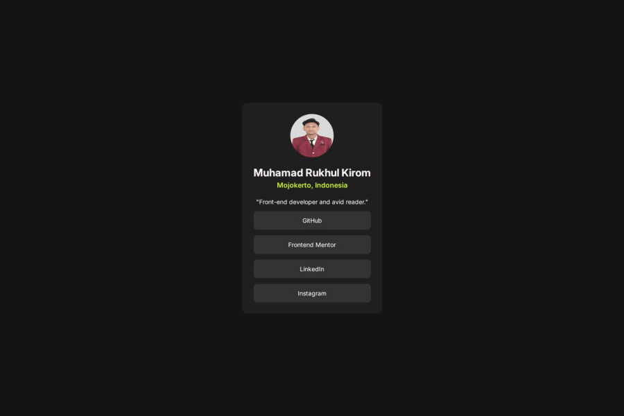
Responsive Social Links Profile using CSS Flexbox


Design comparison

Solution retrospective
I’m most proud of how clean and well-structured the code is, making it easy to read and maintain. The dark theme with contrasting green accents creates a visually appealing and modern look. Using Flexbox ensures proper alignment and responsiveness, while the smooth hover effects on the social media links enhance user interaction.
Next time, I would introduce CSS variables for colors and avoid redundant styling by grouping common properties. These improvements would make the project more scalable, user-friendly, and easier to update in the future.
What challenges did you encounter, and how did you overcome them?One of the challenges I encountered was ensuring that the card design remained responsive across different screen sizes. Initially, the card looked great on larger screens, but on smaller devices, some elements felt cramped. To overcome this, I used flexbox to center the content properly.
Another challenge was making the social media links visually appealing while maintaining good accessibility. At first, the hover effect didn’t stand out enough. I refined the styling by adding a background color change and a slight contrast shift, ensuring better user interaction.
What specific areas of your project would you like help with?-
Responsiveness & Mobile Optimization – The design looks good on larger screens, but I want to ensure it adapts well to all devices. Are there better CSS techniques I can use to improve responsiveness, especially for very small screens?
-
Hover & Focus States – I added hover effects to make the buttons more interactive. Do they feel intuitive, or are there improvements I could make to enhance the user experience further?
-
Code Optimization – I tried to keep my CSS clean, but I feel there might be redundant styles. Are there any ways I can refactor my CSS to make it more efficient and scalable, perhaps using CSS variables or utility classes?
Community feedback
- @NovicksPosted 20 days ago
Your code is well structured, but you just need to pay attention to some lines that sometimes end up being repeated in your style.css, such as .social-media ul li a or display: inline-block is repeated twice, which ends up being redundant.
1- For better responsiveness on different screen sizes, I recommend using the @media screen and (min-width or max-width) CSS, which changes part of your application's style at certain width measurements, allowing your application to adapt to different screen sizes. I recommend that you structure your site with the mobile version in mind first, so that when you use the media query to adapt the layout from mobile to computer, it will be easier and simpler to adapt the elements to a larger screen.
2- The hover and focus states are great, congratulations on your work.
3- When it comes to optimizing style.css, I recommend that you always try to check if certain lines of code are already found in parent elements of the object you are styling so that there is no code redundancy, but your code in general is optimized and very clean.
0 - @jdrodriguez2707Posted 29 days ago
Hi, @rukhulkirom. I hope you're doing great! Your solution looks really good, you replicated the design very well. Also, I really liked that you used
<ul>and<li>elements for the social links list. I actually incorporated them into my own solution thanks to you!Here are some tips I can give you according to your requests:
-
About the responsiveness & mobile optimization, the design looks great on all devices! However, you might consider adding some horizontal padding to ensure proper spacing around the card on smaller screens.
-
Another thing to improve is the measurement units you used. Instead of px, consider using rem for better adaptability to different user font sizes. This ensures that your website remains accessible and scales properly. I recommend this article for a deeper understanding.
-
You could also add transitions so the hover effects look more fluid, for example:
.social-media ul li a {
  display: inline-block;
  width: 100%;
  height: 100%;
  display: inline-block;
  width: 100%;
  color: hsl(0, 0%, 100%);
  padding: 13px;
  text-decoration: none;
  font-size: 14px;
  font-weight: 400;
  border-radius: 8px;
  transition: 0.3s ease;
}
This is optional, though. The hover effects already look good and interactive.
-
About the code optimization, As you mentioned, adding classes and CSS variables could be beneficial. While they might not seem necessary for small projects, you'll notice a significant difference in larger ones.
-
Also, consider exploring alternative ways to add fonts, such as using
@font-facein CSS or the<link>tag in HTML instead of@import. This can improve performance. -
Finally, I noticed that the profile image looks slightly irregular. You can use the aspect-ratio property to maintain the correct width-to-height ratio, along with object-fit to ensure the image adapts properly without distortion. Here's how:
.card .profile-card img {
    width: 100px;
    border-radius: 50%;
    aspect-ratio: 1 / 1;
    object-fit: cover;
}
Make sure to remove the height property so it adjusts automatically. You can learn more about aspect-ratio in the MDN docs
That's all. Keep up the great work, and happy coding! 🚀.
0 -


Please log in to post a comment
Log in with GitHub
Join our Discord community
Join thousands of Frontend Mentor community members taking the challenges, sharing resources, helping each other, and chatting about all things front-end!
Join our Discord