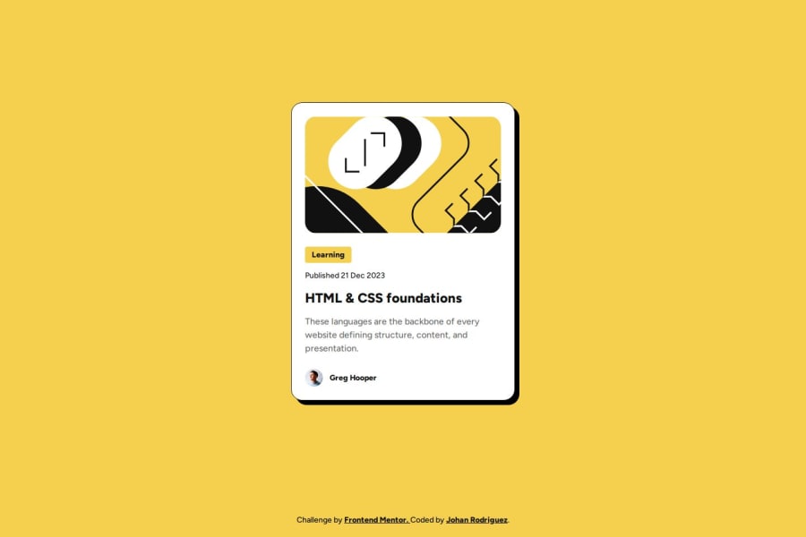


Design comparison
SolutionDesign

Solution retrospective
What challenges did you encounter, and how did you overcome them?
I couldn't find a way to reduce the text size in smaller screens like it was required in the design without using media queries. But at the end, GitHub Copilot helped me and I could use some CSS functions like clamp() and calc() to overcome this. And now the card and the text is responsive without using any media queries.
I wonder if it's right to use the property aspect-ratio in this case. Does it have some effect on the images? For example:
.author-avatar {
  width: 3.2rem;
  height: 3.2rem;
  max-width: 64px;
  max-height: 65px;
  aspect-ratio: 64 / 65;
}
I'd appreciate any feedback about this. Thanks!

Join our Discord community
Join thousands of Frontend Mentor community members taking the challenges, sharing resources, helping each other, and chatting about all things front-end!
Join our Discord