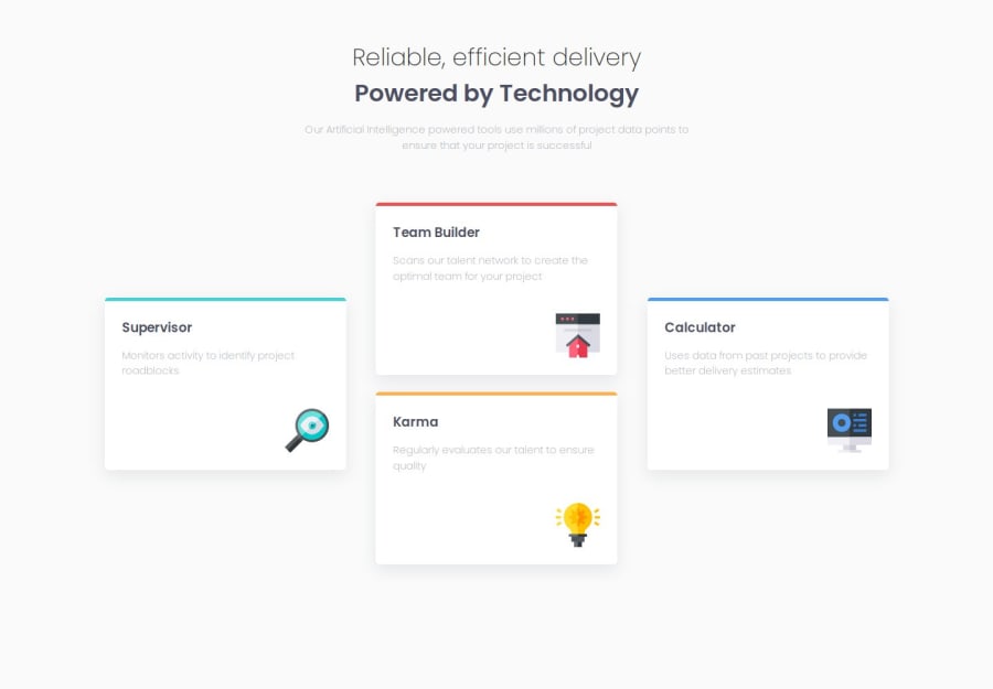
Design comparison
Solution retrospective
I am happy to have completed this project. It was a technical one.
What challenges did you encounter, and how did you overcome them?The initial challenge was to make the card responsive on smaller screens. The cards formed a plus sign on desktop view, making it difficult to change on mobile view.
Community feedback
- @jdrodriguez2707Posted 8 months ago
Hi Fatahi, I hope you're doing great! Your project looks great overall. It's just a small detail and my personal opinion, but you might consider adding it. It's about the vertical scrolling that appears on some screens (like mine) and seems unnecessary. I had this issue too, and here's how you can fix it. You just have to replace the margin property for padding in the main section, like this:
main {
  /* margin: 50px auto;  Remove this one*/
  padding: 50px /* Add this one */
}
Finally, you could also add the gap property to ensure some space between the cards when the screen is getting smaller:
.container {
  gap: 20px;
}
Keep improving!
0
Please log in to post a comment
Log in with GitHubJoin our Discord community
Join thousands of Frontend Mentor community members taking the challenges, sharing resources, helping each other, and chatting about all things front-end!
Join our Discord
