@Biankii48Submitted over 1 year ago
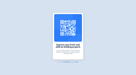
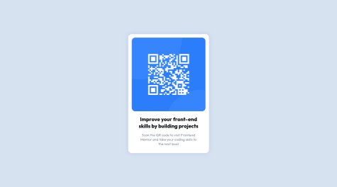
I had difficulty centering the QR image to the div, but after long research, I found a solution. This is the final result.

I had difficulty centering the QR image to the div, but after long research, I found a solution. This is the final result.
Hey Faith Bianca Aragon, how are you ? I really liked the result of your project, but I have some tips that I think you will enjoy:
display:flex; justify-content:center; align-items:center; .display:grid; place-items:center;Please provide feedback on how I can improve
Hey Madu Chimeremeze Clinton, how are you ? I really liked the result of your project, but I have some tips that I think you will enjoy:
<div class="container"> with <main class="container"> and <div class="card"> with <section class="card"> for semantic page.Semantic HTML refers to the use of HTML tags that accurately describe the content of a webpage, rather than just its appearance. Using semantic HTML can improve the accessibility and SEO of a webpage, as well as make the code easier to read and understand for developers.
Here are a few reasons why it is important to use semantic HTML:
The rest is great.
Great work and keep going.
How do i work on the media queries for the mobile design it was difficult
Hey Faith Kalu Onyeani, how are you ? I really liked the result of your project, but I have some tips that I think you will enjoy:
Media queries are a powerful tool for creating responsive designs that adapt to different screen sizes and device types. Here are a few tips for working with media queries in your mobile design:
I hope these tips are helpful! Let me know if you have any other quest.
Great work and keep going.
During the project I used css grid and css flexbox. If you think that is necessary to do any change, please let me know, will be helpful !
Hey Wellington Marques, how are you ? I really liked the result of your project, but I have some tips that I think you will enjoy:
display:grid;place-items:center;display:flex; justify-content: center; align-items: center;.Great work and keep going.
Hey ark.gor, how are you ? I really liked the result of your project, but I have some tips that I think you will enjoy:
Semantic HTML refers to the use of HTML tags that accurately describe the content of a webpage, rather than just its appearance. Using semantic HTML can improve the accessibility and SEO of a webpage, as well as make the code easier to read and understand for developers.
Here are a few reasons why it is important to use semantic HTML:
verall, using semantic HTML can improve the accessibility, SEO, and code readability of a webpage, and is an important best practice in front-end development.
Mobile first design is a design approach in which the design process is started by designing for mobile devices and then progressively adding features for larger screens such as tablets and desktop computers. There are several reasons why implementing a mobile first approach in front-end development can be beneficial:
Overall, a mobile first approach helps ensure that the site is optimized for the growing number of mobile users, while also providing a better overall user experience for all users.
The rest is great.
Great work and keep going.
In this challenge, I had some difficulties regarding the exact moment to use flexbox or use grid. So, when is it recommended to use each of them?
Hey Luan Souza, how are you ? I really liked the result of your project:
The CSS Grid Layout and Flexbox are both layout tools that allow developers to create complex and responsive layouts for websites and applications. There are a few key differences between the two that can help determine when to use each one:
In general, if you need to create a layout with rows and columns, or if you need more precise control over the layout of your elements, Grid is the better choice. On the other hand, if you need to create a simple, one-dimensional layout and have more flexibility in aligning and distributing elements, Flexbox is a good option.
It's also worth noting that both Grid and Flexbox can be used together in the same layout, depending on your specific needs.
Great work, and happy coding.
I code this challenge so please review it.
Hey Rajeev kumar, how are you ? I really liked the result of your project, but I have some tips that I think you will enjoy:
background-size: 100% 50%;.Mobile first design is a design approach in which the design process is started by designing for mobile devices and then progressively adding features for larger screens such as tablets and desktop computers. There are several reasons why implementing a mobile first approach in front-end development can be beneficial:
Overall, a mobile first approach helps ensure that the site is optimized for the growing number of mobile users, while also providing a better overall user experience for all users.
The rest is great.
Great work and keep going.
Would be more than happy to hear your suggestions and some tips on improving the code. 🙏
Hey Malek, how are you ? I really liked the result of your project, but I have some tips that I think you will enjoy:
The title on a web page is usually tagged as an H1 tag. While this isn't always the case, it makes sense in most cases. By making the title of your page an H1 heading, it shows that it's one of the most important pieces of content on the page. It’s important to remember that SEO can often be about user optimization as well as optimization for search.
The rest is great!
Great work, and happy coding.
Hey Mehedi Hasan Likhon, how are you ? I really liked the result of your project, but I have some tips that I think you will enjoy:
The rest is great!
Great work, and happy coding.
all feedbacks are welcome, thank you
Hey Prithivi Raj, how are you ? I really liked the result of your project, but I have some tips that I think you will enjoy:
<div class="card"> with <section class="card"> and <div class="attribution"> with <footer class="attribution"> for semantic page. You can read more about semantic HTML here: HTML Semantic Elements.margin: 0 auto; .box-shadow: -11px 10px 19px -3px rgba(0,0,0,0.75); -webkit-box-shadow: -11px 10px 19px -3px rgba(0,0,0,0.75); -moz-box-shadow: -11px 10px 19px -3px rgba(0,0,0,0.75); .You can try an online box shadow generator like this Box Shadow CSS Generator.
The rest is great!
Great work, and happy coding.
Hello, thank you for coming and looking at my code!
This is my solution for this challenge, i'm very happy to complete this challenge . I hope it's up to the standards, but if it's not, please feel free to tell me!
Thank you in advance.
Hey Malek , nice work. I have one tip for you 😁.
Great work, and happy coding
I tried to use image-set to switch between mobile and desktop background images on different widths, but it didn't seem to work properly at all..
UPD:
Hey Anna, nice work. I have some tips for you.
background-size: 100% 50%;.The rest is great.
Great work and keep going.