

Design comparison
SolutionDesign

Solution retrospective
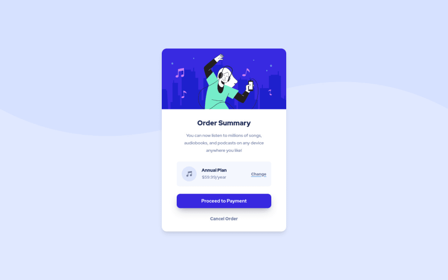
I tried to use image-set to switch between mobile and desktop background images on different widths, but it didn't seem to work properly at all..
UPD:
- improved semantics (<div> => <section>)
- kinda fixed the bg position (I guess the image-set is too advanced for me yet lmao)
Community feedback
- @hatemhenchirPosted almost 2 years ago
Hey Anna, nice work. I have some tips for you.
- To fix the background size, you need to set the width 100% and the height 50% of your background like this:
background-size: 100% 50%;. - replace <div class="card"> with <section class="card"> for semantic page. You can read more about semantic HTML here: HTML Semantic Elements.
- Implement a Mobile First approach.
The rest is great.
Great work and keep going.
Marked as helpful2 - To fix the background size, you need to set the width 100% and the height 50% of your background like this:

Please log in to post a comment
Log in with GitHub
Join our Discord community
Join thousands of Frontend Mentor community members taking the challenges, sharing resources, helping each other, and chatting about all things front-end!
Join our Discord