Design comparison
Community feedback
- @hatemhenchirPosted almost 2 years ago
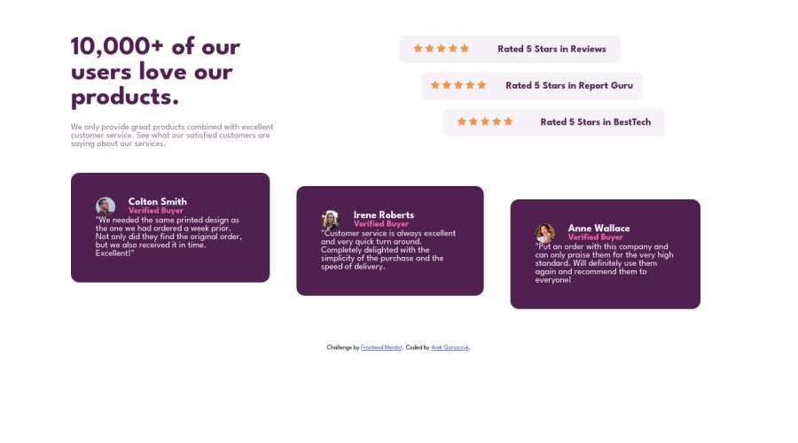
Hey ark.gor, how are you ? I really liked the result of your project, but I have some tips that I think you will enjoy:
- For semantic page, I think the best choice is to divide your page in 2 section. The first section have 2 articles. The second section have 3 articles (cards).
Semantic HTML refers to the use of HTML tags that accurately describe the content of a webpage, rather than just its appearance. Using semantic HTML can improve the accessibility and SEO of a webpage, as well as make the code easier to read and understand for developers.
Here are a few reasons why it is important to use semantic HTML:
- Accessibility: Semantic HTML tags provide additional context and meaning to the content of a webpage, which can be helpful for users with disabilities who rely on assistive technologies such as screen readers.
- SEO: Search engines use the structure and content of a webpage to understand its relevance and ranking. Using semantic HTML tags can help search engines understand the content and context of a webpage, which can improve its ranking in search results.
- Code readability: Using semantic HTML tags can make the code easier to read and understand, which can be helpful for developers working on a project.
verall, using semantic HTML can improve the accessibility, SEO, and code readability of a webpage, and is an important best practice in front-end development.
- Implement a Mobile First approach.
Mobile first design is a design approach in which the design process is started by designing for mobile devices and then progressively adding features for larger screens such as tablets and desktop computers. There are several reasons why implementing a mobile first approach in front-end development can be beneficial:
- Increased mobile usage: More and more people are using their mobile devices to access the internet, so it's important to prioritize the mobile experience.
- Better performance: Mobile devices often have slower processors and less memory compared to desktop computers, so starting with a mobile design can help ensure that the site performs well on all devices.
- Responsive design: A mobile first approach helps ensure that the site is responsive, meaning it adjusts to fit the screen size of the device it is being viewed on. This is important because it provides a better user experience and can improve the site's search engine rankings.
- Simplicity: Starting with a mobile design forces designers to prioritize content and simplify the layout, which can result in a more user-friendly experience for all users.
Overall, a mobile first approach helps ensure that the site is optimized for the growing number of mobile users, while also providing a better overall user experience for all users.
The rest is great.
Great work and keep going.
0
Please log in to post a comment
Log in with GitHubJoin our Discord community
Join thousands of Frontend Mentor community members taking the challenges, sharing resources, helping each other, and chatting about all things front-end!
Join our Discord
