Not Found
Not Found
Not Found
Not Found
Not Found
Not Found
Not Found
Not Found
Not Found
Not Found
Not Found
Not Found
Not Found
Not Found
Not Found
Not Found
Not Found
Not Found
Not Found
Not Found

All comments

  • Darek 140

    @DarekRepos

    Submitted

    What are you most proud of, and what would you do differently next time?

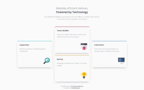
    i created flexible font sizes (fluid typography) and media queries. I used Flexbox and CSS Grid. Next time, I will use more JavaScript to my solution.

    What challenges did you encounter, and how did you overcome them?

    The challenge I encountered was combining grid with Flexbox to achieve the most optimal solution. I believe I chose a very flexible approach.

    What specific areas of your project would you like help with?

    I want to learn more about Dynamic Component-Based Architecture. Is my solution with Flexbox and Grid the optimal one? There's definitely still a lot to learn in this area. If you have any suggestions for improvement or find any mistakes in my code, please let me know. I'd be very grateful for the feedback!

    @erratic-enigma

    Posted

    Hello, nice job on the project!

    The card grid on the desktop viewport sizes looks good, but at smaller viewport sizes (such as around 590px), the cards reach their minimum width and cause horizontal scrolling. You could either reduce the minimum width of the cards, or increase the media query width to around 650px.

    A few other points:

    • On small viewports, the heading text needs to be center aligned.
    • I would recommend using em units for media queries; here's an article that covers why.

    Marked as helpful

    0
  • @isadoraguiar

    Submitted

    What are you most proud of, and what would you do differently next time?

    Proud to finish the project.

    What challenges did you encounter, and how did you overcome them?

    No big challenges in this specific project.

    What specific areas of your project would you like help with?

    Nothing yet.

    @erratic-enigma

    Posted

    Hello, great work on this challenge!

    The styling looks good, but some of your HTML is not semantic. Namely:

    • the .instructions-items is an ordered list of items, so should be an ol element.
    • the .nutrition-table is a tabular breakdown of nutritional information, so should be a table element.

    Marked as helpful

    0
  • @VH135

    Submitted

    What are you most proud of, and what would you do differently next time?

    It was a good challenge to refresh my knowledge of using hover effects and media queries to add a mobile version of the card.

    Also I'm back to SCSS and it's awesome, my work with styles is more comfortable and effective now.

    Pixel Perfect is a great tool to check how my work matches with the layout and I'm quite satisfied this time with the result.

    Next time I want to do a fully responsive design.

    What challenges did you encounter, and how did you overcome them?

    It still takes a lot of time, I have to make it faster. It comes with time, so I have to be patient and persistent.

    What specific areas of your project would you like help with?

    Any feedback about media queries and responsive design is very welcome.

    @erratic-enigma

    Posted

    Hello, nice work on this challenge! There's a few improvements I can suggest:

    I would recommend using either flexbox or grid to center the card. The position: absolute and transform method is unwieldly and will likely give you problems on future challenges. Here's an article about this if you're unsure.

    I see you used role="main" on the .container div. You should replace the div with the main element instead. It serves the same purpose as role="main". Same thing with the .attribution div; replace it with a footer element.

    I would recommend applying classes directly to the elements you want to style rather than wrap them in a div with a class. Some wrappers are necessary (i.e.: .card-author-wrapper, .card-image and .card-tag), but most of them just add unnecessary noise for no benefit.

    Regarding making this challenge responsive, I would start by trying to remove the fixed px width in favour of max-width for the card. The image shouldn't need a fixed px width either.

    Marked as helpful

    1
  • SIBI 80

    @sibi404

    Submitted

    What are you most proud of, and what would you do differently next time?

    I'm able to complete the challenge as the design given

    What challenges did you encounter, and how did you overcome them?

    There is no much harder challenges in this project. Most of the things are familiar to me. Main goal of this challenge is to implement hover effect.

    What specific areas of your project would you like help with?

    I would like to know more about the changes to be made while displaying different pages.

    @erratic-enigma

    Posted

    Hello, nice job on the challenge! The styling of this looks good, but there are things about the markup I would change:

    The .card-container should be a main landmark element rather than a div element.

    You should use a elements for the social media link buttons rather than div elements. They are supposed to be links users can click on and visit. Something like:

    <a href="https://example.com">Example</a>
    

    Marked as helpful

    1
  • @Derek-Walton

    Submitted

    What are you most proud of, and what would you do differently next time?

    using more semantic html

    What challenges did you encounter, and how did you overcome them?

    actual phone view being distorted, fixed by using a flex grow.

    What specific areas of your project would you like help with?

    any improvements would be appreciated

    @erratic-enigma

    Posted

    Nice work on this challenge! There's a few improvements I can suggest:

    You might be interested in reading this article that covers how to plan this challenge's HTML. There are improvements from the article I feel you could implement.

    Try to favour using classes consistently in both your markup and CSS. For example, giving classes to your h2 and button elements and selecting those classes in your CSS.

    You are given two images of the product to display depending on the viewport size, but your solution only uses one of them in an img element. You should use a picture element to achieve this (the aforementioned article discusses how to use this element if you're unsure).

    Happy coding!

    Marked as helpful

    1
  • Burnlees 80

    @Burnlees

    Submitted

    What are you most proud of, and what would you do differently next time?

    Most proud of using sole flex, rather than grid like my previous challenge. As well as the time it took me to finish. Next time, I'd like to further improve my skills at accurately replicating sizing from the designs.

    What challenges did you encounter, and how did you overcome them?

    Struggled getting the card to align centered vertically using align-items, overcame this by doing some research and realising I needed to define a height of the parent container.

    What specific areas of your project would you like help with?

    I'd like any general tips on how to improve this, if there is any more elegant solutions to what I've done.

    @erratic-enigma

    Posted

    Hi, good work on this project! Here's some improvements I would suggest:

    The .published-date should be a p element rather than a div, ideally with the date wrapped in a time element.

    Give the body element a min-height of 100vh rather than a height. You should generally avoid using a fixed height on elements containing text, including the body.

    The .card has a width set in pixels. This causes horizontal scrolling on smaller viewports. Use a max-width instead (ideally in rems) so the card shrinks in size on smaller viewports.

    The .card being set to display: flex is redunant and can be removed.

    Marked as helpful

    0
  • @VickyAzola

    Submitted

    Hi! 👋 In this challenge, I learned to center an absolute element without using hardcoded numbers 😊

    I have some questions for the community:

    • How can I make the <svg> hover activate with the other elements? For now, every element is separated, and the hover is individual.
    • How can I fix the form email container when the error message is displayed? It adds space to the <div>, making it bigger.

    If you have some insight into those problems, please let me know. Thanks! 🤗

    Dark Theme Landing Page

    #tailwind-css

    1

    @erratic-enigma

    Posted

    Hello! Nice work on the solution; looks really good!

    I'm not too familar with Tailwind, so I'm unsure about how to address the seperate hovering issue on the <svg> elements.

    For the second question, in your JavaScript, you add and remove the text within the error message <p> on these lines:

    11: errorMessage.textContent = "Please enter a valid email adress";
    19: errorMessage.textContent = "";
    

    The text content inside the <p> element sets its height, which in turn changes the height of the parent <div> element. Instead of adding and removing the text content, you could instead apply a visibility style like so:

    11: errorMessage.style.visibility="visible";
    19: errorMessage.style.visibility= "hidden";
    

    The visibility CSS property hides or shows an element without removing it from the document flow, which in this case means the height will be retained.

    Hope this helps! 😃

    Marked as helpful

    0