Not Found
Not Found
Not Found
Not Found
Not Found
Not Found
Not Found
Not Found
Not Found
Not Found
Not Found
Not Found
Not Found
Not Found
Not Found
Not Found
Not Found
Not Found
Not Found
Not Found

All solutions

  • Submitted

    Four Card Feature Section

    #sass/scss#vite
    • HTML
    • CSS

    0


    What are you most proud of, and what would you do differently next time?

    Got to grips with using the auto-fit value in the grid, which reorganises the cards as the viewport size increases.

    Was able to figure out the layout of the cards on the large viewport sizes and implement it using grid-template-areas.

  • Submitted

    Recipe Page

    #sass/scss#vite
    • HTML
    • CSS

    1


    What are you most proud of, and what would you do differently next time?

    This is my first time experimenting with container queries, though I only used them for applying border-radius on the image when the main element reaches certain minimum widths:

    @container (width >= 42.875em /* 686px */) {
      border-radius: …
    }
    

    Interested to take advantage of them on larger projects in the future.

    What challenges did you encounter, and how did you overcome them?

    On small viewports, the image fits across the full width of the page, but the rest of the content has whitespace on both sides. I didn't want to use an extra wrapper with padding applied around the content. Instead, I made use of grid with the following columns:

    grid-template-columns: [gutter-start] minmax(auto, 1.75rem) [content-start] 1fr [content-end] minmax(auto, minmax(auto, 1.75rem) [gutter-end];
    

    positioned all the content inside of the content column:

    main > * { grid-column: content; }
    

    then positioned the image across all available columns:

    .opening-image { grid-column: gutter; }
    

    What specific areas of your project would you like help with?

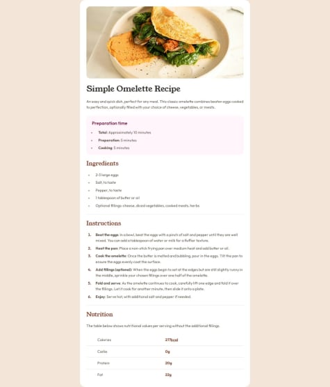
    I'm not entirely sure if I structured the markup for the table properly, so any pointers on that would be nice.

    I'm also not sure about the way I applied positioning styles to the ul and ol elements. Are there any better methods than using margin and padding?

  • Submitted

    Blog Preview Card

    #sass/scss#vite
    • HTML
    • CSS

    0


    What are you most proud of, and what would you do differently next time?

    I wanted the drop shadow of the card to react to the state of the child a element (i.e.: when a user hovers and focuses on the link, the drop shadow changes as well). This was a perfect time to try out the new :has() pseudo-class, used to select the card (.blog-preview) when the child a element (.link-wrap) is interacted with.

    .blog-preview:has(.link-wrap.-overlay:is(:focus, :hover, :active)) { … }
    

    What challenges did you encounter, and how did you overcome them?

    Because the illustration was a vector graphic, I opted to use an svg element to display it. However, the object-fit property, useful for cropping images, doesn't appear to work with svg elements. Thankfully, an svg attribute called preserveAspectRatio provides similar results as object-fit. This article goes into more detail about it.

    What specific areas of your project would you like help with?

    _

  • Submitted

    Product Preview Card Component

    #sass/scss#vite
    • HTML
    • CSS

    1


    Don't have any specific questions about this challenge, but feedback is welcomed. 🙂

  • Submitted

    QR Code Component

    #vite#sass/scss
    • HTML
    • CSS

    1


    Any thoughts or recommendations on appropriate alt text for the QR code image? I left it as '' as I wasn't sure what to write in it.