Submitted over 1 year ago
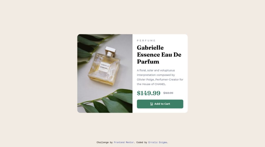
Product Preview Card Component
#sass/scss#vite
@erratic-enigma
Design comparison
SolutionDesign
Solution retrospective
Don't have any specific questions about this challenge, but feedback is welcomed. 🙂
Community feedback
- P@sergrosuPosted 10 months ago
You're pretty close. One thing I would change, is the cart icon: it's a style element and it's probably not a good idea to have it in your html. You can implement it inside your button using the
::beforepseudo-element:.button-cart::before { content: ""; width: 15px; height: 16px; background-image: url(../images/icon-cart.svg); }0
Please log in to post a comment
Log in with GitHubJoin our Discord community
Join thousands of Frontend Mentor community members taking the challenges, sharing resources, helping each other, and chatting about all things front-end!
Join our Discord
