Not Found
Not Found
Not Found
Not Found
Not Found
Not Found
Not Found
Not Found
Not Found
Not Found
Not Found
Not Found
Not Found
Not Found
Not Found
Not Found
Not Found
Not Found
Not Found
Not Found

Submitted

Four Card Feature Section

@erratic-enigma

Desktop design screenshot for the Four card feature section coding challenge

This is a solution for...

  • HTML
  • CSS
1newbie
View challenge

Design comparison


SolutionDesign

Solution retrospective


What are you most proud of, and what would you do differently next time?

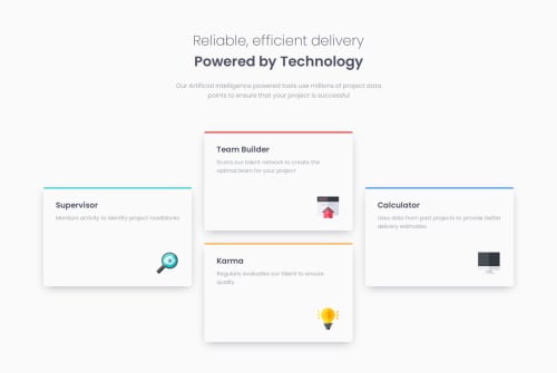
Got to grips with using the auto-fit value in the grid, which reorganises the cards as the viewport size increases.

Was able to figure out the layout of the cards on the large viewport sizes and implement it using grid-template-areas.

Community feedback

P

@DarrickFauvel

Posted

Hi @erratic-enigma, 👋

Your solution looks great! Responsive with three layouts. Very nice!

I don't think I have anything substantive to really add. I did this project in 2022 with Vite and Vanilla CSS. If I were to redo this project, I would use Tailwind CSS as I do now with all my projects. I also use the React framework, Next.js, quite a bit now and use its built-in Tailwind support. It can make your html elements look a bit weird when utilizing the additional Tailwind classes, but it makes it easier to make components with their own stylings attached to the class attribute.

I have also used SASS in other projects, but I think Tailwind is winning me over for its ease-of-use and customization.

If you haven't tried Tailwind CSS, you may want to give it a try at some point in your journey. https://tailwindcss.com

I hope this personal perspective is a little helpful. Keep up the great work! 👍

0

Please log in to post a comment

Log in with GitHub
Discord logo

Join our Discord community

Join thousands of Frontend Mentor community members taking the challenges, sharing resources, helping each other, and chatting about all things front-end!

Join our Discord