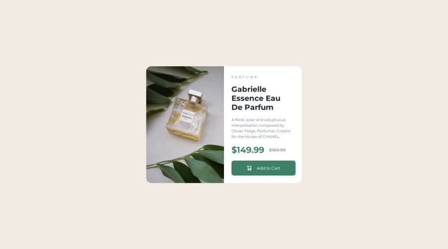
responsive shop item using css flex and media queries.


Design comparison

Solution retrospective
using more semantic html
What challenges did you encounter, and how did you overcome them?actual phone view being distorted, fixed by using a flex grow.
What specific areas of your project would you like help with?any improvements would be appreciated
Community feedback
- @erratic-enigmaPosted 8 months ago
Nice work on this challenge! There's a few improvements I can suggest:
You might be interested in reading this article that covers how to plan this challenge's HTML. There are improvements from the article I feel you could implement.
Try to favour using classes consistently in both your markup and CSS. For example, giving classes to your
h2andbuttonelements and selecting those classes in your CSS.You are given two images of the product to display depending on the viewport size, but your solution only uses one of them in an
imgelement. You should use apictureelement to achieve this (the aforementioned article discusses how to use this element if you're unsure).Happy coding!
Marked as helpful1 - @danielmrz-devPosted 8 months ago
Hello @Derek-Walton!
Your project looks great!
I have a suggestion about your code that might interest you:
📌 You can use the
<picture>tag when you have different versions of the same image.Using the
<picture>tag will help load the correct image to the user's device, saving bandwidth and improving performance.Example:
<picture>
    <source media="(max-width: 460px)" srcset="{desktop image path here}">
    <img src="{mobile image path here}" alt="{alternative text here}">
</picture>
I hope this helps!
Other than that, excellent work!
Marked as helpful1 - @Lo-DeckPosted 8 months ago
Hi well done for this challenge.
You can't put
<h3>or<p>in<span><span class="prices"> <h3>$149.99</h3> <p>$169.99</p> </span>You can check out your html with 3WC validator.3wc.
And if you want to set different images you can use
<picture><picture> <source media="(max-width: 799px)" srcset="your path" > <source media="(min-width: 800px)" srcset="your path" > <img src="your path" alt="your description" > </picture>Here a link mozilla.
Marked as helpful1


Please log in to post a comment
Log in with GitHub
Join our Discord community
Join thousands of Frontend Mentor community members taking the challenges, sharing resources, helping each other, and chatting about all things front-end!
Join our Discord