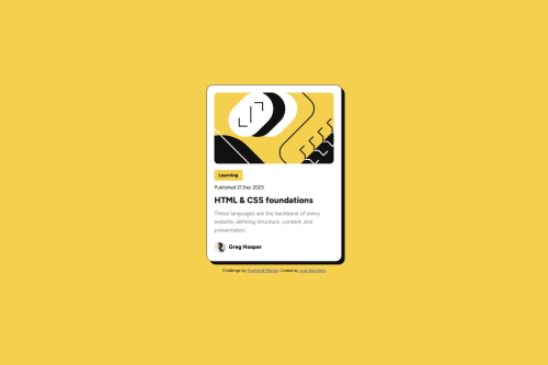
Submitted over 1 year agoA solution to the Blog preview card challenge
Blog Preview Card using Flex
accessibility
@Burnlees

Solution retrospective
What are you most proud of, and what would you do differently next time?
Most proud of using sole flex, rather than grid like my previous challenge. As well as the time it took me to finish. Next time, I'd like to further improve my skills at accurately replicating sizing from the designs.
What challenges did you encounter, and how did you overcome them?Struggled getting the card to align centered vertically using align-items, overcame this by doing some research and realising I needed to define a height of the parent container.
What specific areas of your project would you like help with?I'd like any general tips on how to improve this, if there is any more elegant solutions to what I've done.
Code
Loading...
Please log in to post a comment
Log in with GitHubCommunity feedback
No feedback yet. Be the first to give feedback on Burnlees's solution.
Join our Discord community
Join thousands of Frontend Mentor community members taking the challenges, sharing resources, helping each other, and chatting about all things front-end!
Join our Discord