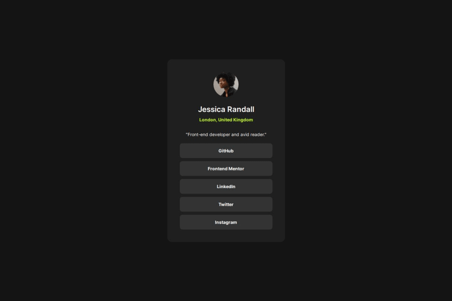
Design comparison
Solution retrospective
I'm able to complete the challenge as the design given
What challenges did you encounter, and how did you overcome them?There is no much harder challenges in this project. Most of the things are familiar to me. Main goal of this challenge is to implement hover effect.
What specific areas of your project would you like help with?I would like to know more about the changes to be made while displaying different pages.
Community feedback
- @erratic-enigmaPosted 8 months ago
Hello, nice job on the challenge! The styling of this looks good, but there are things about the markup I would change:
The
.card-containershould be amainlandmark element rather than adivelement.You should use
aelements for the social media link buttons rather thandivelements. They are supposed to be links users can click on and visit. Something like:<a href="https://example.com">Example</a>Marked as helpful1@sibi404Posted 8 months agoThank you for your valuable feedback. It's really helpful for me @erratic-enigma
0 - Account deleted
Great work done, man. Although I would suggest using some animation in the hover effect as It will look realistic. Something like transition delay will work better try it.
0@sibi404Posted 8 months agoThank you for your feedback. Definitely I will try it @AnujCodeIt
0
Please log in to post a comment
Log in with GitHubJoin our Discord community
Join thousands of Frontend Mentor community members taking the challenges, sharing resources, helping each other, and chatting about all things front-end!
Join our Discord
