
Elizabeth Sotomayor
@elizabethrsotomayorAll solutions
- Submitted about 2 months ago
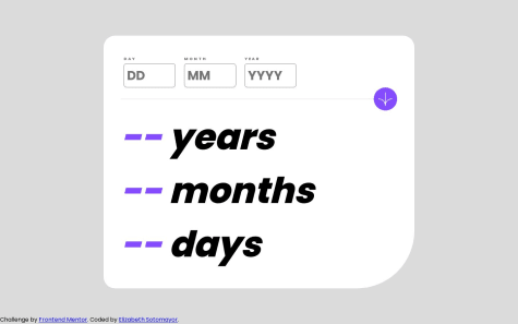
React.js Responsive Mortgage Calculator App
- HTML
- CSS
- JS
I would like help with rendering custom error states as shown in the mockup. I made the input fields
requiredbut aside from that it doesn't change the color of the labels when a field is empty. - Submitted 3 months ago
Responsive Product List with Cart using CSS Grid/Flexbox/JavaScript
- HTML
- CSS
- JS
I would like help with the use of the Document Fragment. In my project, I reused a Fragment twice to create the items in the cart and order confirmation and I am wondering if this is a common practice to reuse the Fragment. I feel like when each item is dynamically created my code looks a bit repetitive with the use of
createElementandsetAttributefor each item so I'm wondering if there's a better/cleaner way to go about populating the cart/order confirm modal. - Submitted almost 2 years ago
Responsive ratings component using HTML/CSS media queries + JavaScript
- HTML
- CSS
- JS