@namlh023Submitted over 3 years ago
Latest solutions
Latest comments
- @danielduduPosted over 3 years ago
Hi Ryan! It looks nice even with grid. You could try flexbox also - with align-self: (flex-start, center, flex-end).
Marked as helpful0 - @Kamasah-DicksonSubmitted over 3 years ago@danielduduPosted over 3 years ago
@Kamasah-Dickson good work!
Try to change the main divs with semantic elements like: <main>/<article>/<footer> Aldo for the <footer> you could use position:fixed in order to make it stick to the bottom
0 - @Aryan-ki-codepantiSubmitted over 3 years ago@danielduduPosted over 3 years ago
@Aryan-ki-codepanti
Nice job.
I'd make a position: fixed for the <footer> in order to keep it on the bottom of the page. I also would make a max-width instead of width and work a little more with the main image (try to make it display: block & max-width: 100% and avoid fixed width so it will be consistent with the rest of the card text
0 - @carlin-mitchellSubmitted over 3 years ago@danielduduPosted over 3 years ago
@carlin-mitchell
Hello!
You could use only CSS flex for this challenge. I don't see the reason to use tables.
Also, make sure you use semantic HTML. For example your footer does not have a <footer></footer> tag
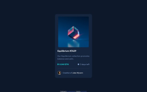
And you should check the backslashes you have used: --- use / instead (check HTML issues report)
Bad value images\icon-ethereum.svg for attribute src on element img: Backslash () used as path segment delimiter.
Context: ble-text
><img src=images\icon-ethereum.svgclass=icon`><spanMarked as helpful0 - @danielduduSubmitted over 3 years ago@danielduduPosted over 3 years ago
Thank you, Anmol! I will consider your suggestion and change accordingly. I guess I left myself dragged too much towards animations.
1 - @rnguecoSubmitted almost 4 years ago@danielduduPosted almost 4 years ago
Hi Ryiana,
It looks very good!
I would add background-position: center center to you bg image to make it stretch a little more centered on the subject.
Also the breakpoint on media query - i would put id sooner, somewhere around 550px or maybe 600px to give a sooner desktop view and keep the initial card distorsion to a minimum.
Alternativeley, you could set the article_card div to a width of maybe 375px ...
Hope that will help :)
Marked as helpful0