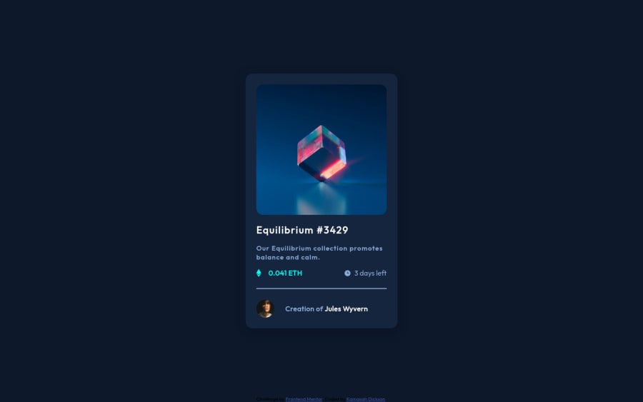
Design comparison
Solution retrospective
please I would really appreciate your comments and opinions on this design.
Community feedback
- @elesismailovPosted over 3 years ago
Really good job!
There are only some 5-min changes needed.
When you see something that changes states on the design, it almost always means it is supposed to be interactive. It could be a button, or a link, or any kind of interactive element. So in your case, you would expect the preview image or card title to take you somewhere, to the
Learn more about...for instance. The same is true for the profile elements, the name and avatar; again you would want to learn more about the author when you clicked on it. So make the image container, title, author's name and profile pic links.About the animation, instead of changing the width of the overlay you could use
transform: func()css property. It is great for this type of things! Plus it would work for hover and leave states.Good luck!
1@Kamasah-DicksonPosted over 3 years ago@eleswastaken Thank you so much I really appreciate your comment on the use of the css transform property.
0 - @danielduduPosted over 3 years ago
@Kamasah-Dickson good work!
Try to change the main divs with semantic elements like: <main>/<article>/<footer> Aldo for the <footer> you could use position:fixed in order to make it stick to the bottom
0
Please log in to post a comment
Log in with GitHubJoin our Discord community
Join thousands of Frontend Mentor community members taking the challenges, sharing resources, helping each other, and chatting about all things front-end!
Join our Discord
