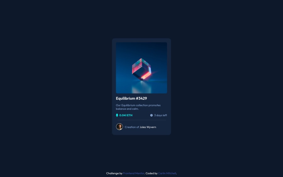
Responsive card using flexbox and lots of googling
Design comparison
Solution retrospective
This one was difficult for me due to needing an overlay image and semi-opaque background at the same time. Fun times, and thank goodness for google! Also, sizing and centering the Ethereum and clock icons was not too fun. I would be curious to know if I went about it the right way or if there is something more efficient I could have done.
My main concern now is, how can I keep the footer info from creeping up over the card when I zoom in. I have yet to figure this out.
Any other comments/insights would be greatly appreciated!
Thanks!
Community feedback
- @mpbrunellePosted over 3 years ago
Hello,
CSS-tricks has published two articles on sticky footer that might help you solve your problem:
Good luck!
Marked as helpful0 - @danielduduPosted over 3 years ago
@carlin-mitchell
Hello!
You could use only CSS flex for this challenge. I don't see the reason to use tables.
Also, make sure you use semantic HTML. For example your footer does not have a <footer></footer> tag
And you should check the backslashes you have used: --- use / instead (check HTML issues report)
Bad value images\icon-ethereum.svg for attribute src on element img: Backslash () used as path segment delimiter.
Context: ble-text
><img src=images\icon-ethereum.svgclass=icon`><spanMarked as helpful0
Please log in to post a comment
Log in with GitHubJoin our Discord community
Join thousands of Frontend Mentor community members taking the challenges, sharing resources, helping each other, and chatting about all things front-end!
Join our Discord
