Article preview component with HTML, CSS, and JS


Design comparison

Solution retrospective
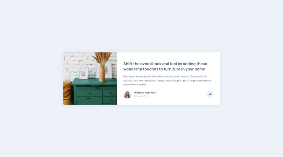
My solution to the "Article preview component" challenge, implemented using HTML, CSS, and JavaScript. Feedback on any part of my code is appreciated!
Community feedback
- @danielduduPosted almost 4 years ago
Hi Ryiana,
It looks very good!
I would add background-position: center center to you bg image to make it stretch a little more centered on the subject.
Also the breakpoint on media query - i would put id sooner, somewhere around 550px or maybe 600px to give a sooner desktop view and keep the initial card distorsion to a minimum.
Alternativeley, you could set the article_card div to a width of maybe 375px ...
Hope that will help :)
Marked as helpful0@rnguecoPosted almost 4 years ago@danieldudu Thanks Daniel! I think I like the second one better :)
I've set the card max-width to 375px and added some padding on the main body element, so for even smaller screens it would shrink but still have a bit of padding on both sides.
0 - @AgataLiberskaPosted almost 4 years ago
Hi @rngueco! Nice work on this challenge, it looks really nice!
One thing I'm not sure about is the inline event handler. It probably doesn't matter as much in such a small project but in a larger one you'd normally want to separate all your script from html, or am I wrong?
I also noticed that the little triangle isn't perfectly centered which makes the position of your modal a bit off in desktop layout. An easy way to center an element positioned absolutely is to offset it by 50% (so for your triangle:
left: 50%). This moves the left edge to the middle of the parent, and all you need to do is move it back by 50% of its own width using the transform property (transform: translateX(-50%)). You could use the same principle to position the modal itself: offset by the amount of padding + half the width of the button, then usetransform: translateto move it back by 50% of its width. I think it's neater than trying to find the exact pixel value that would look nice :)Hope this helps!
Marked as helpful0@rnguecoPosted almost 4 years ago@AgataLiberska Thank you, this was helpful!
I originally was supposed to add event listeners in the JS script, but I didn't think it mattered for this specific project as well lol. But I separated it anyway, since I think it's good practice to do so.
As for the positioning, I hadn't thought of that so thanks! I managed to position the little triangle as you described, but as for the modal itself I still had to do a bit of estimation. I had to hard-code half the length of the share button to get to its center. I think it's fine though.
I updated my code to reflect the changes. Thanks again!
0 - @hachi-opsPosted almost 4 years ago
This comment was deleted over 3 years ago
0@rnguecoPosted almost 4 years ago@hachi-ops Hi Hachi!
I'm not sure what you mean by centered. It is centered horizontally and vertically in my screen for both desktop and mobile.
0


Please log in to post a comment
Log in with GitHubJoin our Discord community
Join thousands of Frontend Mentor community members taking the challenges, sharing resources, helping each other, and chatting about all things front-end!
Join our Discord