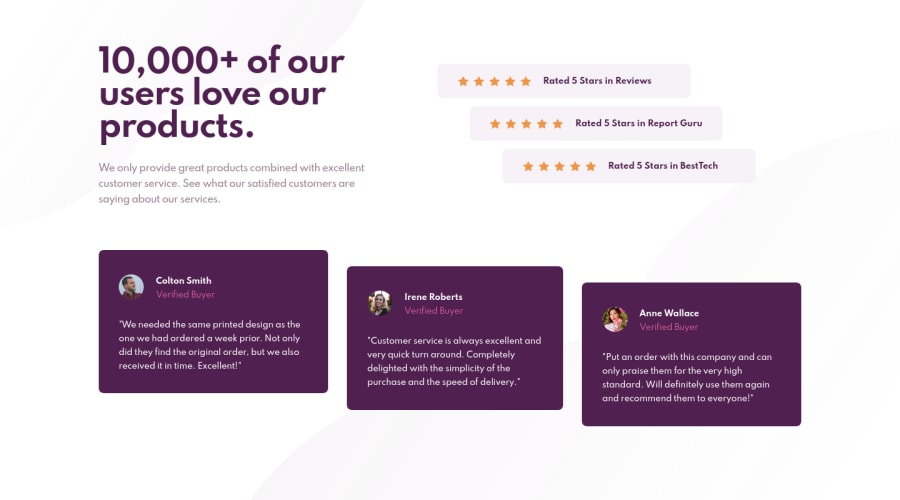
Design comparison
SolutionDesign
Solution retrospective
Look forward to any suggestions. I tried to implement grids for this design. Thanks
Community feedback
- @danielduduPosted over 3 years ago
Hi Ryan! It looks nice even with grid. You could try flexbox also - with align-self: (flex-start, center, flex-end).
Marked as helpful0
Please log in to post a comment
Log in with GitHubJoin our Discord community
Join thousands of Frontend Mentor community members taking the challenges, sharing resources, helping each other, and chatting about all things front-end!
Join our Discord
