Latest solutions
Latest comments
- @A-amonSubmitted over 3 years ago@daniel-hennigPosted over 3 years ago
I really love the animations and the parallax effect. The code looks semantic as well!
I've found just one little issue when you go to 1800px wide screen and larger: The position of the image of
.hero {background-image}is downwards quite too much in my opinion, so that you can barely see the orange fruit. Maybe you can increase thebackground-position-yand theheightof.heroby somevw-units. Usually I try to make my projects responsive/fluid up to 3000px since a lot of my friends have really large screens.Awesome solution, anyway, my debugging-friend!
Marked as helpful0 - @pamelarose28Submitted over 3 years ago@daniel-hennigPosted over 3 years ago
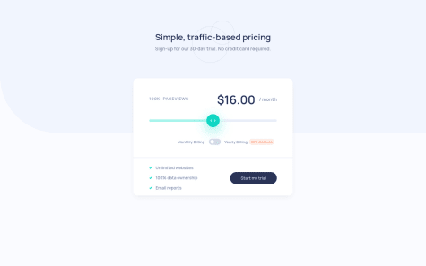
Hey Pamela, I see you're having some trouble here. I had the same problem and I have researched a lot to solve this arrow slider thum image problem. Maybe my solution can help you, just have a look and if you've questions to my code, I'll help :)
Marked as helpful0 - @Tejas-117Submitted almost 4 years ago@daniel-hennigPosted almost 4 years ago
hey Tejas, I really like the simplicity of your solution from desktop to mobile layout design. In fact, I had an responsive image issue (with the paddern) on my own Insure-LP-solution and I could solve this problem, because of your solution. Regarding to your solution, I can find two issues on the layout from 900px and below. First: Between the family-image and the intro-details is like a little white space. Maybe you can get rid off it by putting the family-image and the intro-details within one div (I had also the same issue in my solution) - if it's not working, let me know please. Second: After opening the hamburger menu, the menu isn't overlaying the full screen. Maybe my solution can help you there. All in all, I can understand your code very easily, which I like.
Have a nice weekend :)
Daniel
0


