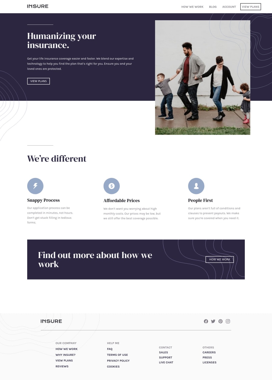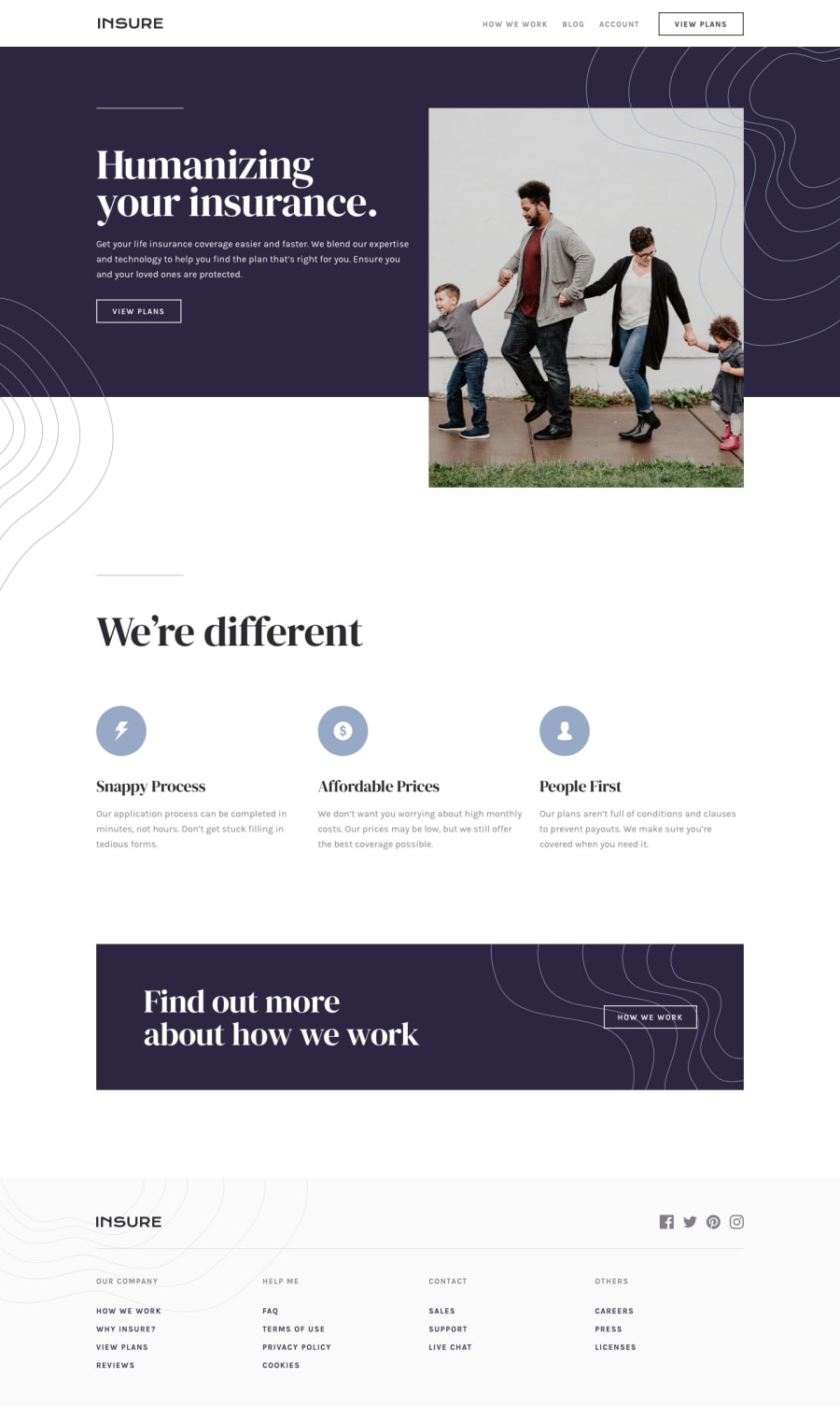
Design comparison
Solution retrospective
Any feedback is appreciated :)
Please log in to post a comment
Log in with GitHubCommunity feedback
- @daniel-hennig
hey Tejas, I really like the simplicity of your solution from desktop to mobile layout design. In fact, I had an responsive image issue (with the paddern) on my own Insure-LP-solution and I could solve this problem, because of your solution. Regarding to your solution, I can find two issues on the layout from 900px and below. First: Between the family-image and the intro-details is like a little white space. Maybe you can get rid off it by putting the family-image and the intro-details within one div (I had also the same issue in my solution) - if it's not working, let me know please. Second: After opening the hamburger menu, the menu isn't overlaying the full screen. Maybe my solution can help you there. All in all, I can understand your code very easily, which I like.
Have a nice weekend :)
Daniel
Join our Discord community
Join thousands of Frontend Mentor community members taking the challenges, sharing resources, helping each other, and chatting about all things front-end!
Join our Discord
