this might be a MASTERPIECE (must see on mobile, tablet and laptop)


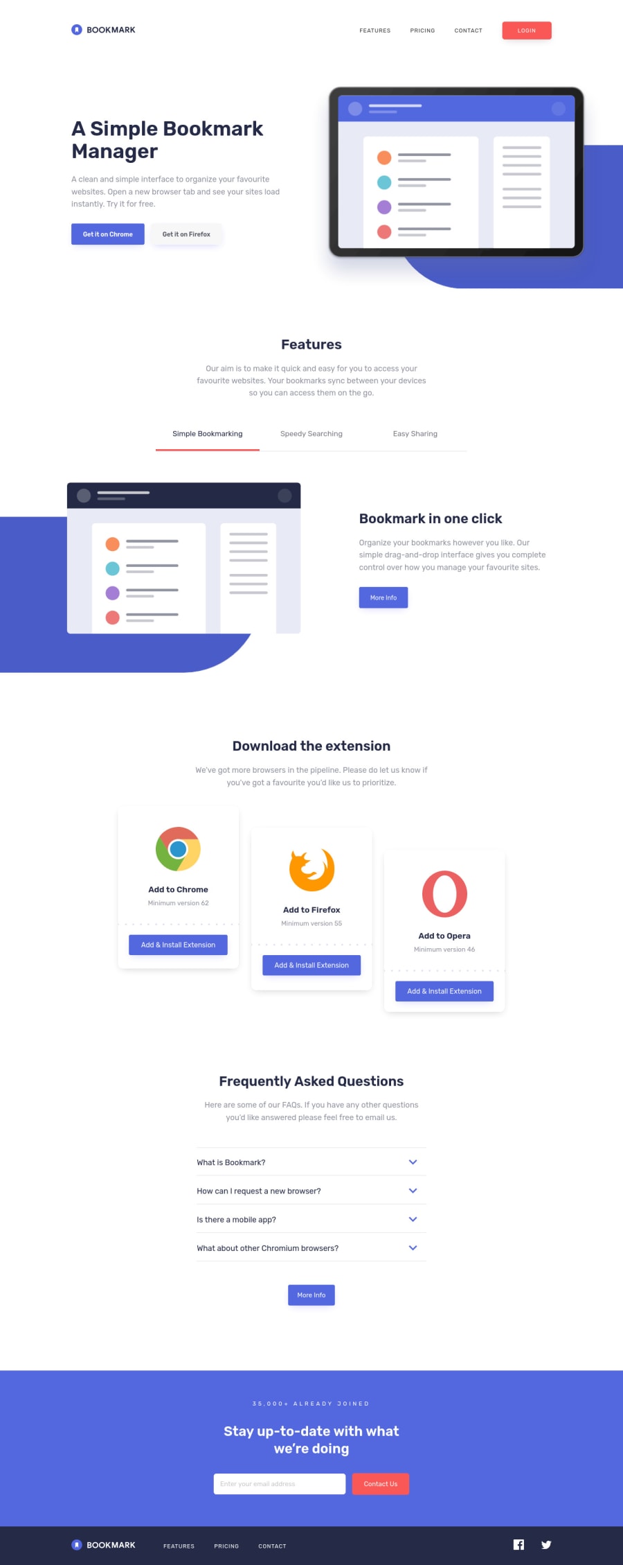
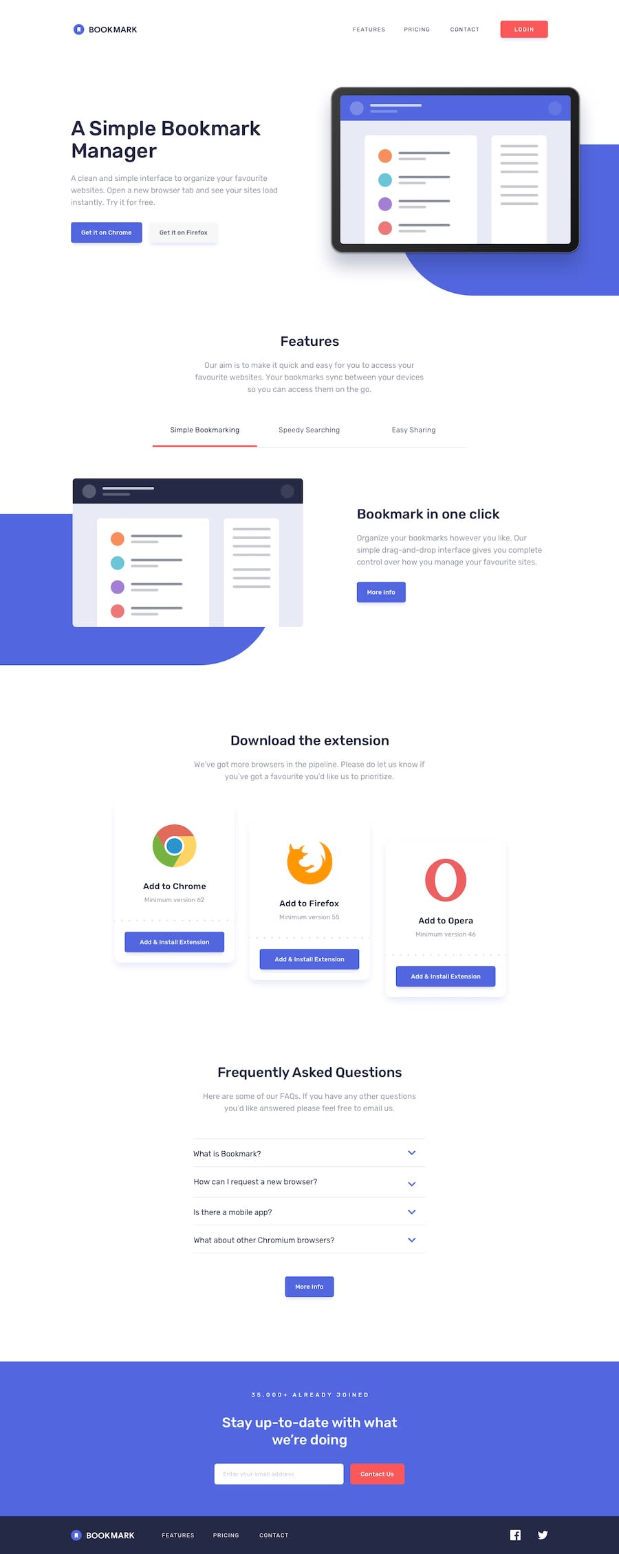
Design comparison
Solution retrospective
- SEMANTIC html5, css3/ scss, vanillaJS
- customized svg images/ codes
- smooth transitions on nav-menu, tab-menu/ slider and accordion (faq)
- hamburger-menu animation (as always)
- almost pixel perfect (I used the design images, not the desig files for PRO members, yet)
- clean and efficient code
This challenge was a bit tricky though, because some of the provided images didn't have the blue background shapes as they have in the design images - so that I had to create the shapes by myself with Adobe XD (I edited svg images with XD the first time).
After all, I tried my best best and I highly appreciate any feedback/ suggestions. You can be as harsh as you like on me. What do you like the most? What can I improve? I want to go moon with my skills, so that I can help others better, too:)
Please log in to post a comment
Log in with GitHubCommunity feedback
- Account deleted
Hi,
Pretty good job on completing the challenge it actually good but there's somethings I need to point out;
- When you go into mobile and activate the mobile menu & then return to desktop while it's still active, it doesn't get dismissed but get carried over... The hamburger transition looks nice though.
- You should also have a maximum width of 1440px on the whole site because when you go over that everything gets stretched out, and doesn't look good.
- & the sliding animations on the features section are pretty nice, though I think the blue background should just stay there and let all the other stuff animate since it's just the same.
Keep coding👍.
Marked as helpful - @A-amon
Hello! That was a great animation. The responsiveness is good too~ 😀
Here are few suggestions:
- It seems like after toggling the hamburger button, and returning to larger size, the
<nav>went nuts! 😅 - That was great effort on customizing the svg 😁 but you could have used pseudo-elements - This is just a suggestion tho! Both works 😂.
- I like the sliding tab animation! (😉 I will be studying your code later on that.) Maybe you can increase the height & width of the
<a>tabs so that the click area is larger and not restricted to the text. - I think you can remove the 'logo icon' from the alt text of images such as 'facebook logo icon'. This could be just my opinion but I think just 'Facebook' would make more sense to screen reader users than the initial. 😀 Resource
Marked as helpful - It seems like after toggling the hamburger button, and returning to larger size, the
- @JSaporski
Congrats on your solution, it really looks awesome how smooth your page is when you go to responsive :D


Join our Discord community
Join thousands of Frontend Mentor community members taking the challenges, sharing resources, helping each other, and chatting about all things front-end!
Join our Discord