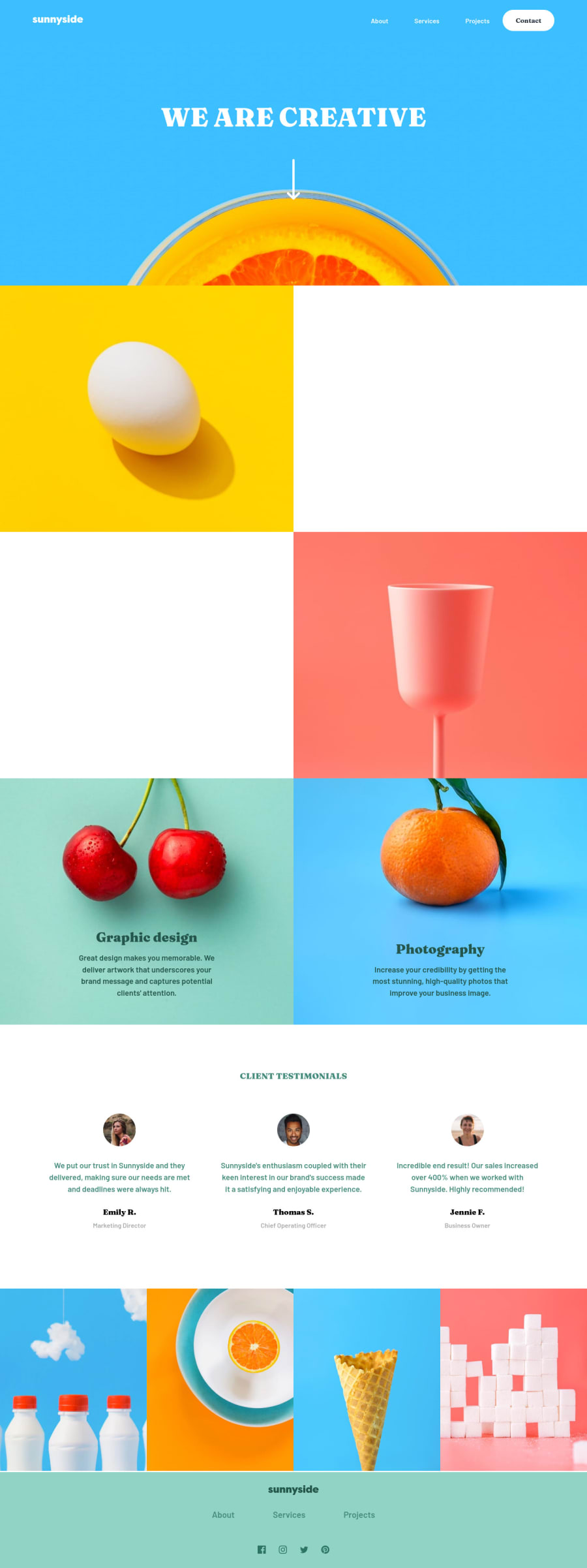
Design comparison
Solution retrospective
Hello! I got a few questions: 🤔
- How to increase svg's height and width (without cropping it)
- How to remove the empty gaps/spaces on .images__image
Any other feedback are welcome! (Especially on semantics and accessibility 😂)
Community feedback
- @markup-mitchellPosted over 3 years ago
- use viewbox. eg your social media icons: remove
width="20"andheight="20"and useviewbox="0 0 20 20"instead. Now use CSS to setwidth/heightin whatever units you like. - images are displayed as
inlineelements by default and the gap at the bottom is for text descenders. Usedisplay: blockorvertical-align: middleon yourimgelements.
I didn't look at your semantics and accessibility in much detail; I'm suspicious of aria tags as they're often unnecessary and can make things worse if misused, but hiding the SVG and labelling the link seems like a safe bet to me. Good effort!
Marked as helpful1@A-amonPosted over 3 years ago@markup-mitchell Thank you! Tho I had to manually adjust the viewbox values to get the right size 😂
0 - use viewbox. eg your social media icons: remove
- @daniel-hennigPosted over 3 years ago
I really love the animations and the parallax effect. The code looks semantic as well!
I've found just one little issue when you go to 1800px wide screen and larger: The position of the image of
.hero {background-image}is downwards quite too much in my opinion, so that you can barely see the orange fruit. Maybe you can increase thebackground-position-yand theheightof.heroby somevw-units. Usually I try to make my projects responsive/fluid up to 3000px since a lot of my friends have really large screens.Awesome solution, anyway, my debugging-friend!
Marked as helpful0@A-amonPosted over 3 years ago@daniel-hennig Thank you! I didn't notice the issue on larger screens 😂 I changed the
background-positiontobottomand I think that solved it. 😀Glad you like the animation! I spent my time, thinking on what to animate (I know it's weird to spend time on this~😂)
1@daniel-hennigPosted over 3 years ago@A-amon
background-positiontobottomis even better. Very good!Well for me it's not weird at all to spend some good time on animations, because animations are just making so much fun, therefore I completely understand you😄
0
Please log in to post a comment
Log in with GitHubJoin our Discord community
Join thousands of Frontend Mentor community members taking the challenges, sharing resources, helping each other, and chatting about all things front-end!
Join our Discord
