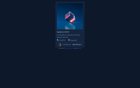
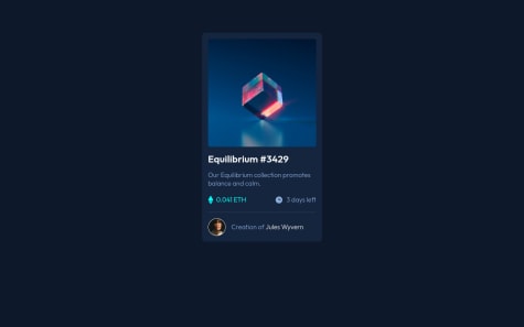
I decided to use React for this solution. But a couple of issues occurred. In the initial load of the page in the boxes for the numbers is displayed NaN. I cope with it with && operator but then another issue pop in. When the seconds countdown it reaches 2 and never reaches 1 and 0. I think it may be from the re-rendering but I am not sure. I am open for any advices.
Coder Suresh
@coderSureshAll comments
- @mitkokazakovSubmitted 9 months ago@coderSureshPosted 9 months ago
Hey there, nice work.
The NaN you are seeing on the initial load for a second is because you are setting
nstate with the value oftimeValuewhen it is undefined.You can simply check if
timeValueis defined and set thenstate accordingly.For example: You can add following line below line number 28 of your
CounterCard.jsxif (!timeValue) returnIf you do this, you see noting for a second (for which you were previously seeing NaN) and then the timer starts.
Marked as helpful0 - @Joe-77Submitted 11 months ago@coderSureshPosted 11 months ago
Hey there Awesome work
I haven't viewed your code yet.
But looking at preview, I found a couple of issues.
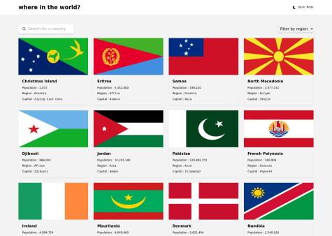
First of all, the dark mode is not persisting when I reload the page. You can persist user-selected theme mode by storing it in the localStorage.
Another issue is, chips showing border country on details page are not showing properly. They are cutting from bottom. Maybe you can add margin bottom to the container so give it some white space.
And what I am going to write below this line is not necessarily a problem but I think it can be improved.
-
I think the shadow can be decreased but it's totally a personal preference.
-
Since some flags have more width and some have more height, it is hard to make all of them look good.
1 -
- @HaarithBinSaburSubmitted about 1 year ago
I'm still trying to get used to using flex-box and CSS grid. I remember reading somewhere that they are both different in some ways and sometimes you would use one over the other. So please feel free to drop a comment and help me build more confidence and websites.
@coderSureshPosted about 1 year agoHello there,
To put it simply, Flexbox is a one-dimensional tool while Grid is two-dimensional. With Flexbox, you cannot control both rows and columns simultaneously, whereas CSS Grid allows you to do so.
If you want to learn more about Flexbox and Grid, I recommend watching Kevin Powell's YouTube video where he explains these tools in detail. You can find the video at this link: https://www.youtube.com/watch?v=3elGSZSWTbM. Additionally, you may find it helpful to read the comments section below the video as many people have shared their thoughts and opinions on these tools.
Marked as helpful1 - @nataliesmythSubmitted about 1 year ago
I've been working on using components and utility classes on projects recently, and in this project it seemed to be more repetitive to use utility classes rather than styling everything in each individual class in the style sheet. My question is if this is a problem because utility classes work better for more complex projects, or did I just not follow through with my utility classes? Thanks!
@coderSureshPosted about 1 year agoHi there, great work.
I am seeing a couple of issues with your project.
First of all, your HTML has some validation errors. (You can validate your HTML here: https://validator.w3.org/)
The first issue is that we can't use any
<section>or<div>inside of the<ul>. In this case, you can remove the<section class='desktop-error'>and it will work fine.Another issue is that it is better not to use a trailing slash
/on a self-closing element. For example, you are using an input tag as<input type='text' ... />which can be used as
<input type='text' ... >You can read the reason here https://github.com/validator/validator/wiki/Markup-%C2%BB-Void-elements#trailing-slashes-in-void-element-start-tags-do-not-mark-the-start-tags-as-self-closing
The third issue is that we can't use
<span>as a child of<ul>. Instead, you can put<span>inside the<li>tag.For example, you are showing an error message as:
    <li>
            <input type="email" id="mail" name="user_email" placeholder="Your email address..."
              class="form-input border-round">
    </li>
    <span role="alert" id="emailError" aria-hidden="true">
              <em>Please provide a valid email address</em>
    </span>
But, it is better to do it this way,
<li>
            <input type="email" id="mail" name="user_email" placeholder="Your email address..."
              class="form-input border-round">
            <span role="alert" id="emailError" aria-hidden="true">
              <em>Please provide a valid email address</em>
            </span>
</li>
The final issue I am seeing is that the image is overflowing on smaller devices and that is because you are setting fixed width using rem unit.
I saw on line 75 of
style.cssthat you are settingmax-width: 100%;on img and picture tag. However, I saw no effect of using it.Instead, you can set
width: 100%;so that the image takes full width on the smaller screen and takes maximum35.45188remwhen the device width is larger than35.45188rem.This way you can make the image responsive.
Thanks.
Marked as helpful1 - @linomattosSubmitted about 1 year ago
I made the project with tailwind CSS. With the help of the perfect pixel extension.
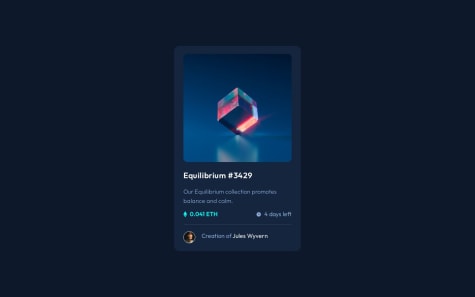
I have problems with the active state of the hover image. I can convert the color of the image but the eye icon has lower opacity.
@coderSureshPosted about 1 year agoHey there, excellent work.
I didn't know anything like the Pixel Perfect extension existed. Thanks for this.
I have created a pull request on your repo to solve your issue with the hover state overlay and icon. You can find it here: https://github.com/retronauta/frontend-mentor-nft-preview/pull/1
Alternatively, you can look through my solution here: https://github.com/coderSuresh/nft-preview-card
And, if you don't feel like going through links, here is a general idea of how I did it.
index.html- use img_container class - use custom css to display overlay on hover (in input.css) --> <div class="img_container relative flex cursor-pointer justify-center items-center h-fit my-6" > <!-- - making overlay with view icon - bg-transparent-cyan is a custom color from tailwind.config.js - that gets its value from css variable in input.css --> <div class="overlay absolute pointer-events-none top-0 hidden left-0 w-full h-full bg-transparent-cyan rounded-xl" > <div class="absolute top-1/2 left-1/2 transform -translate-x-1/2 -translate-y-1/2" > <img src="./images/icon-view.svg" alt="view icon" class="w-12" /> </div> </div> <!-- - we don't need any pointer events on this image - using pointer-events-none class --> <img src="./images/image-equilibrium.jpg" alt="Nft picture" class="rounded-xl pointer-events-none" /> </div>input.css:root { --transparent-cyan: hsla(178, 100%, 50%, 0.50); } /* make image overlay visible on hovering its parent div */ .img_container:hover .overlay { display: block; }tailwind.config.jsmodule.exports = { content: ['./dist/*.{html, js}'], theme: { extend: { colors: { .... 'transparent-cyan': 'var(--transparent-cyan)' //from css variable (to be used in html) }, fontFamily: { outfit: ['Outfit'], }, }, }, plugins: [], }Marked as helpful1 - @maelacudiniSubmitted about 1 year ago@coderSureshPosted about 1 year ago
Hey there, I am seeing an issue with your project.
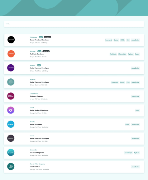
When I type something into the search bar and press enter, a new chip is formed (that thing below the search bar with a cross icon).
If you wish, you can view my solution here, https://job-search-static.netlify.app/
0 - @Abdokhalil11Submitted almost 2 years ago
I Wish It can like You
@coderSureshPosted almost 2 years agoHey Abdokhalil11, nice work. I am noticing some issues here. You can solve some of those by wrapping everything inside <body> tag inside of the <main> tag.
You can validate your HTML code through following URL:
https://validator.w3.org/
Go to the link, click on validate by direct input and paste your code. You can upload your HTML file also. It'll show you issues in your code (if any) along with possible solution.
Marked as helpful0 - @JerryJeagerSubmitted almost 2 years ago@coderSureshPosted almost 2 years ago
Hey Jerry, Nice work. I am noticing some issues here. You can solve some of those by wrapping <section> in <main> tag.
Another issue is, you are using section tag but not heading inside it. You should use at least one heading (h2-h6) tag.
But if you don't want to add heading tag, you have to use <div> tag instead of <section> tag.
You can validate your HTML code through following URL:
Go to the link, click on validate by direct input and paste your code. You can upload your HTML file also. It'll show you issues in your code (if any) along with possible solution.
Marked as helpful1 - @JK-101119Submitted about 2 years ago
Please give feedback.
@coderSureshPosted about 2 years agoHey there, pretty nice work.
I saw there is a couple of accessibility issue. I have added a pull request to your GitHub to solve the issue. Please review.
There is that issue because your code is missing the `<main> tag.
The structure of HTML code is somewhat like this:
 <header>
 <main>
 <footer>
You can view more Here
0 - @YessBlackSubmitted over 2 years ago
Comments welcome on html structure, css layout and best practices, thanks
@coderSureshPosted over 2 years agoHey there. You did a great job.
You can fix those accessibility issues by using the 'main' tag. The 'main' tag specifies the main contents of the document.
Here you can see more about the main tag: https://www.w3schools.com/tags/tag_main.asp
<body>
    <main>
        ........
        ........
    </main>
</body>
0 - @noelroySubmitted almost 3 years ago
What is the best way to centre a div in a page ?
@coderSureshPosted almost 3 years agoTo center a div, you can use flexbox. For example, you have a div with a class name container that contains everything inside a body tag. In order to center that div, you can use flexbox as:
body {
        display: flex;
        align-items: center;
        justify-content: center;
        min-height: 100vh;
}
In this code, we are giving a height of 100 vh (viewport height) which covers the full height of the screen. "align-items: center" centers the div vertically, and "justify-content: center" centers the div horizontally.
I saw that we have a section with a class name container. To center that container, instead of giving it a margin of 10vh, you can use flexbox as shown above.
Let me know if this helped you. If it didn't I am always here for you. Thanks for reading.
Marked as helpful0 - @MSA-newSubmitted almost 3 years ago
Hello everyone.. I'm new in web development.. this is my first challenge from https://www.frontendmentor.io ever.
Here is a list things I didn't know how to do XD:
- How to center the card vertically in the page.
- How to center the content of the card horezontally.
- How to center the content of the card vertically.
- How to change the color of the horezontal line.
- How to make some paragraph on the same line to another paragraph inside the card.
Please look at the picture in "Design" folder to see how the card is supposed to look like. Note: I didn't do anything about the responsive design because I wanted to finish the desktop design first. Thank you...
@coderSureshPosted almost 3 years agoHey there, I hope this answer will be helpful for you.
First of all, there are different ways to center things in CSS. You can use a table, you can use the grid as well as a flexbox, and a position too.
Among them, I love to center things using CSS FlexBox because I know how to use it. You can try any of the methods and use whichever you like.
The block of code for CSS FlexBox is:
div {
        display: flex;
        align-items: center;  /*centers div vertically*/
        justify-content: center; /*centers div horizontally*/
     }
You can see this detailed guide for CSS flexbox.
Now, to change the color of the horizontal line (while using <hr> tag), you can remove its border, give it the desired height, and change its background color. Below is the code:
hr {
        border: none;
        height: 1px;
        background-color: purple;
    }
Sorry, I didn't understand your last question. Feel free to ask any question, I am always ready to help you.
0

