Country API
Design comparison
Community feedback
- @coderSureshPosted 12 months ago
Hey there Awesome work
I haven't viewed your code yet.
But looking at preview, I found a couple of issues.
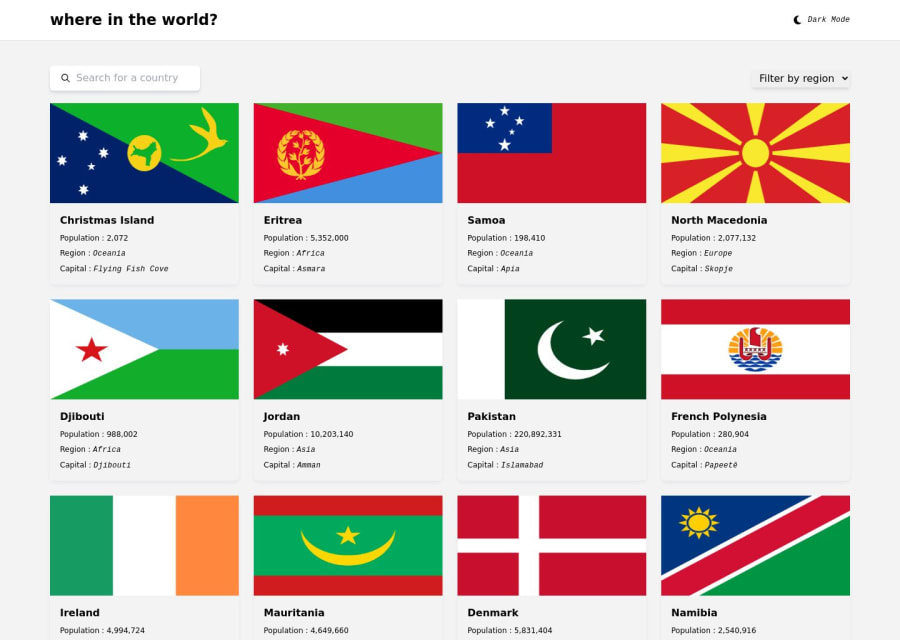
First of all, the dark mode is not persisting when I reload the page. You can persist user-selected theme mode by storing it in the localStorage.
Another issue is, chips showing border country on details page are not showing properly. They are cutting from bottom. Maybe you can add margin bottom to the container so give it some white space.
And what I am going to write below this line is not necessarily a problem but I think it can be improved.
-
I think the shadow can be decreased but it's totally a personal preference.
-
Since some flags have more width and some have more height, it is hard to make all of them look good.
1 -
Please log in to post a comment
Log in with GitHubJoin our Discord community
Join thousands of Frontend Mentor community members taking the challenges, sharing resources, helping each other, and chatting about all things front-end!
Join our Discord
