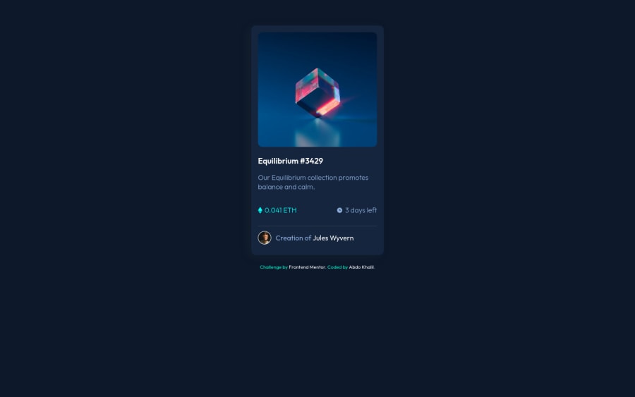
Design comparison
Solution retrospective
I Wish It can like You
Community feedback
- @sandro21-glitchPosted almost 2 years ago
Hi Abdokhalil
Here are a few suggestions for improvement
Use semantic HTML elements: Consider using semantic HTML elements such as header and footer to improve the accessibility of your code.
Make class names descriptive: Consider using class names that accurately describe the purpose of the element, such as card-header instead of photo.
Add alt text: Make sure to add descriptive
alttext to the images in the code.Add hover effects for the card: To make the card more interactive, you can add hover effects to change the background color or add an animation effect on hover.
Happy Coding
Marked as helpful0 - @coderSureshPosted almost 2 years ago
Hey Abdokhalil11, nice work. I am noticing some issues here. You can solve some of those by wrapping everything inside <body> tag inside of the <main> tag.
You can validate your HTML code through following URL:
https://validator.w3.org/
Go to the link, click on validate by direct input and paste your code. You can upload your HTML file also. It'll show you issues in your code (if any) along with possible solution.
Marked as helpful0
Please log in to post a comment
Log in with GitHubJoin our Discord community
Join thousands of Frontend Mentor community members taking the challenges, sharing resources, helping each other, and chatting about all things front-end!
Join our Discord
