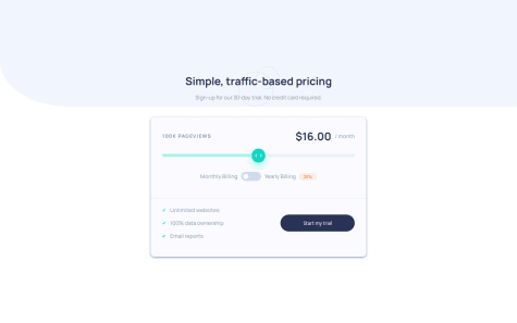
it was very fun to learn how to style range input :)
Abdallah Ali
@boda0077All comments
- @victorJandreuWhat are you most proud of, and what would you do differently next time?@boda0077
👋 Hello! 🎉 congratulations on completing the challenge! 🎉
There is something u missed on this challenge
-
When clicking on toggle button between monthly and yearly Billing the white circle stay right there doesn't move .
-
Background color not the same.
that is it hope i helped you even a little bit .
-
- @Codelearner123456What are you most proud of, and what would you do differently next time?
Getting it to work and not wasting time doing it.
What challenges did you encounter, and how did you overcome them?Getting the image to load. I used a solution to help me.
What specific areas of your project would you like help with?Css.
@boda0077Hi ,
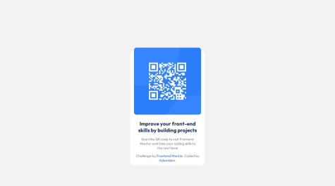
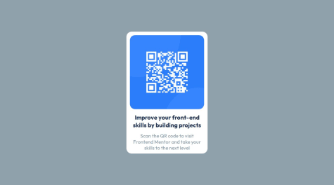
you did great job over here but the image not displayed because your img path in HTML file is wrong that what you did :
<img src="./assets/image-qr-code.png" alt="QR code" />this what you should do :
<img src="./images/image-qr-code.png" alt="QR code" />hope i helped even a little bit .
Marked as helpful - @MateuszWrzWhat are you most proud of, and what would you do differently next time?
I am pleased to have completed this challenge.
What challenges did you encounter, and how did you overcome them?I had no problems
What specific areas of your project would you like help with?Responsive design
@boda0077Hi @MateuszWrz ,
there is something wrong with you project check your HTML File all i can see just Welcome word with white screen .
Marked as helpful - @KNWardWhat are you most proud of, and what would you do differently next time?
This is the quickest I was able to complete a project/challenge. It was very simple and straight to the point.
What challenges did you encounter, and how did you overcome them?I did not encounter any issues. However, when I got to my live site, the image does not show, just the alt text. It is upsetting because I know it works.
What specific areas of your project would you like help with?None.
@boda0077Hi @KNWard ,
wonderful job there you got the same design i see the path of the
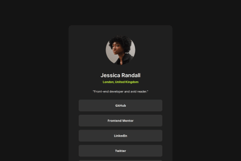
imgare wrong this what you did<img src="/assets/images/avatar-jessica.jpeg" alt="Photo of Jessica Randall">what you need to add is . before /assets like that
<img src="./assets/images/avatar-jessica.jpeg" alt="Photo of Jessica Randall">try this will display the img .
hope i helped you even a little bit
Marked as helpful - @Adanna-NnajioforWhat are you most proud of, and what would you do differently next time?
i am proud of my improvements so far and resilience
What challenges did you encounter, and how did you overcome them?i encountered challenges in putting the two different background colors and images. through the help of chatGTP, i was able to overcome it
What specific areas of your project would you like help with?in grid and javascript
@boda0077Hi @Adanna-Nnajiofor ,
You've done a great job here what i can see that u did not use any JS in this project. what i recommend for you to start with this JS Course For Beginners this course will make you level up your skills in JS.
You asked for help in CSS Grid you can check this funny garden game Grid Garden there is 28 level will make you master Grid.
hope i helped you even little bit.
- @srplantaWhat are you most proud of, and what would you do differently next time?
Using Flexbox and aligning items
What challenges did you encounter, and how did you overcome them?Faced problems by first time uploading files
What specific areas of your project would you like help with?using media queries
@boda0077Hi @srplanta ,
I see you did great job there you just need keep training in CSS to do that you can check the new Learning Paths you will find path for Resposive Layout .
hope i helped you even little bit .
- @WitWizardKWhat are you most proud of, and what would you do differently next time?
This time I learned new keywords
What challenges did you encounter, and how did you overcome them?It's not tough for the last time that I code
What specific areas of your project would you like help with?HTML CSS
@boda0077Hi @WitWizardK ,
you did great job there there is a few things you should take care of it
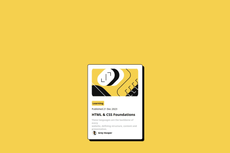
1- the img path is wrong that what u did
<img src="/assets/images/illustration-article.jpg" alt="Blog card" width="290" height="200" class="rounded-corners" />the right path for it
<img src="illustration-article.jpg" alt="Blog card" width="290" height="200" class="rounded-corners" />2- you need to check style-guild file to get the color of the page and font.
hope i helped u even a little bit.
- @mspaularodriguesWhat are you most proud of, and what would you do differently next time?
I think the design aspects are really similar to what was asked in the model; however, the placement of the objects in the website are wonky.
What challenges did you encounter, and how did you overcome them?Mostly arranging the placement of the objects in the page and adapting it to the respective resolutions.
What specific areas of your project would you like help with?Making it responsive was an objective I didn't really accomplish; I'm still confused on how it should be done. I also had trouble hosting the page on my GitHub website; the repository is there, updated, but the URL can't seem to load (I had to insert my Home page in the URL live section in order to submit this solution).
@boda0077Hi @mspaularodrigues,
if you find any hard time make it responsive the you should check : Learning Paths Provides a learning method to building responsive layouts.
To Host Page on Github check that video : Host Webiste on Github.
hope i helped you even little.
- @MariaDoesCodingWhat are you most proud of, and what would you do differently next time?
I'm proud that I finished this project in a single day. I wanted to do this project before, but when I tried it, I failed. But, I decided to try it again today and it was successful.
What challenges did you encounter, and how did you overcome them?I want to know if my code is semantic HTML or not.
@boda0077Hi @MariaDoesCoding ,
Great work looks amazing it is so close to the main design.
what can see in your code you used
<main>element inside HTML file that mean your code is semantic HTML.Different between semantic and non-semantic HTML :1- non-semantic HTML they do not have any meaningful content and also uses a lot of div element in your project without using any of semantic HTML like [header , nav, main, footer , . . .].
2- semantic HTML means "relating to meaning" means using HTML elements to structure your content based on each element's meaning, not its appearance.
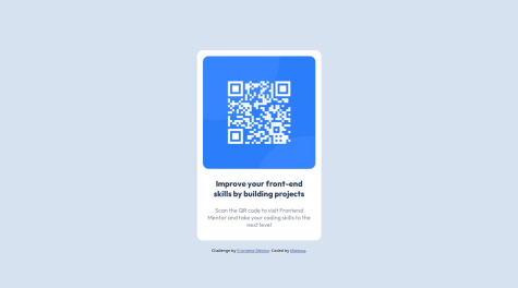
if you wanna place Card in the middle of the screen use in body css
height: 100dvh ;I hope I helped you, even if just a little.
Marked as helpful - P@ifaronti@boda0077
Hi @ifaronti You done great job, there is one problem when I open the site it float to left side and there is free space on Right side. Hope this was helpful.
