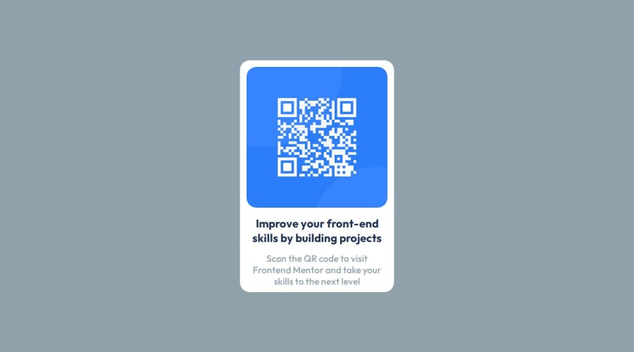
Frontend Mentor - QR code component challenge by using CSS flex box


Design comparison

Solution retrospective
Using Flexbox and aligning items
What challenges did you encounter, and how did you overcome them?Faced problems by first time uploading files
What specific areas of your project would you like help with?using media queries
Community feedback
- P@Islandstone89Posted 12 months ago
HTML:
-
Every webpage needs a
<main>that wraps all of the content, except for<header>andfooter>. This is vital for accessibility, as it helps screen readers identify a page's "main" section. Wrap the card in a<main>. -
The image has meaning, so it must have proper alt text. Write something short and descriptive, without including words like "image" or "photo". Screen readers start announcing images with "image", so an alt text of "image of qr code" would be read like this: "image, image of qr code". The alt text must also say where it leads(frontendmentor website).
-
Never have text in divs alone. "Improve your" is a
<h2>and "Scan the QR code" is a<p>. You don't need to wrap either in a<div>.
CSS:
-
Including a CSS Reset at the top is good practice.
-
Use the style guide to find the correct
background-color. -
Add around
1remofpaddingon thebody, so the card doesn't touch the edges on small screens. -
Move
font-familyandfont-sizefrom:roottobody. -
On the
body, changeheighttomin-height- this way, the content will not get cut off if it grows beneath the viewport. Remove thewidth, as it is 100% wide by default. Changejustify-contentfromspace-aroundtocenter. -
Remove all widths in
%andpx. -
Add a
max-widthof around20remon the card, to prevent it from getting too wide on larger screens. -
Remove
justify-contentfrom the card, it is not needed. -
font-sizemust never be in px. This is a big accessibility issue, as it prevents the font size from scaling with the user's default setting in the browser. Use rem instead. -
Since all of the text should be centered, you only need to set
text-align: centeron the body, and remove it elsewhere. The children will inherit the value. -
Paragraphs have a default value of
font-weight: 400, so there is no need to declare it. -
On the image, add
display: blockandmax-width: 100%- the max-width prevents it from overflowing its container. -
As the design doesn't change, there is no need for any media queries. When you do need them, they should be in rem, not px. Also, it is common practice to do mobile styles first and use media queries for larger screens.
Marked as helpful1@srplantaPosted 12 months ago@Islandstone89 thanks a lot bro, you made me to learn more.
1 -
- @boda0077Posted 12 months ago
Hi @srplanta ,
I see you did great job there you just need keep training in CSS to do that you can check the new Learning Paths you will find path for Resposive Layout .
hope i helped you even little bit .
1


Please log in to post a comment
Log in with GitHub
Join our Discord community
Join thousands of Frontend Mentor community members taking the challenges, sharing resources, helping each other, and chatting about all things front-end!
Join our Discord