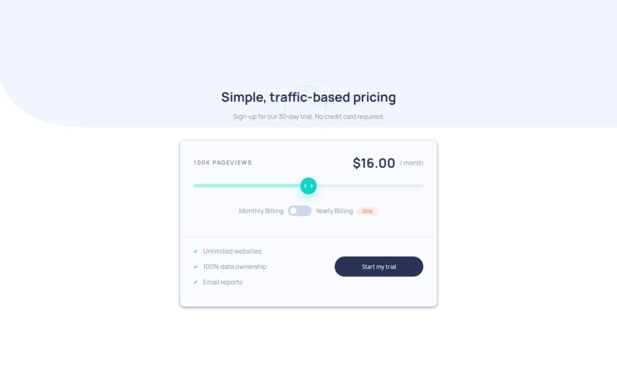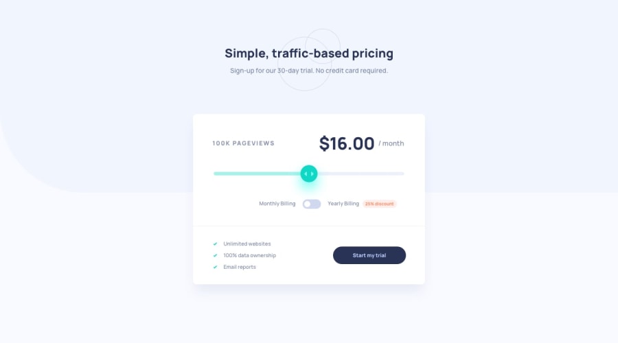
Design comparison
SolutionDesign
Solution retrospective
What are you most proud of, and what would you do differently next time?
it was very fun to learn how to style range input :)
Please log in to post a comment
Log in with GitHubCommunity feedback
- @boda0077
👋 Hello! 🎉 congratulations on completing the challenge! 🎉
There is something u missed on this challenge
-
When clicking on toggle button between monthly and yearly Billing the white circle stay right there doesn't move .
-
Background color not the same.
that is it hope i helped you even a little bit .
-
Join our Discord community
Join thousands of Frontend Mentor community members taking the challenges, sharing resources, helping each other, and chatting about all things front-end!
Join our Discord
