Submitted about 1 year ago
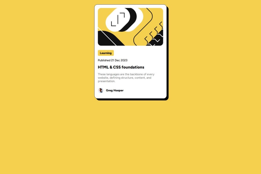
Blog Preview Card Solution (using HTML & CSS)
@MariaDoesCoding
Design comparison
SolutionDesign
Solution retrospective
What are you most proud of, and what would you do differently next time?
I'm proud that I finished this project in a single day. I wanted to do this project before, but when I tried it, I failed. But, I decided to try it again today and it was successful.
What challenges did you encounter, and how did you overcome them?I want to know if my code is semantic HTML or not.
Community feedback
Please log in to post a comment
Log in with GitHubJoin our Discord community
Join thousands of Frontend Mentor community members taking the challenges, sharing resources, helping each other, and chatting about all things front-end!
Join our Discord
