@ByProxy66Submitted almost 2 years ago
Just testing. Not smart enough to have any good questions yet.

Just testing. Not smart enough to have any good questions yet.
Hi there!
The layout works great! The only thing i would suggest you is to shrink a bit the card on mobile layout, maybe by adding some padding / margin on left and right side.
Hope this give you some help!
Cheers
Feedbacks will be welcomed !!!
The project was finished within one hour. It is a great achievement for me.
One question for the community though, how to do it with grid instead of flex ?
Hi there, the easier way to achieve that is (in my opinion) to do something like this.
The sample is pretty raw but hope i gave you the idea of how to do it!
As you see the key is to use column-template-columns and column-template-rows.
Cheers
Hi guys, I hope you're doing great. I just wanted to know if my solution for the purple opacity image thing are valid or if there are better solutions. Thanks for the support :).
Konstantin
Hi there! I had the same issue, @correlucas helped me with this solution!
img {
mix-blend-mode: multiply;
opacity: 80%;
}
Underneath the img you put the background with the purple color and then let mix-blend-mode do the magic. Source
For the other request i don't understand what you mean.
Hope to have been helpful! Cheers
How can you adjust the position of the span element? I've tried it using css margin but it did not move.
Hi there!
For your request try use padding-left:1.5em; in span class.
Hope to have been helped you!
Cheers
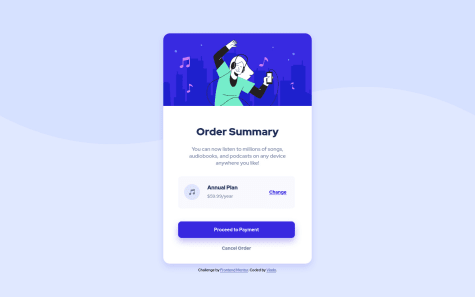
Hello all 🙂 This is my version of the assignment. Any comment is welcome! 😊
Hi there! your layout works well, but part of the challenge is to build also a mobile friendly layout, so you should consider width like 320/375 pixels, you can achieve with media queries to target different resolution or also resize automatically with calc() or min() and clamp() for text. In general best practice is to build your pages firstly on mobile layout and then expand to larger screens.
Lastly you could consider to add an hover animation on the "proceed to payment" button. Something like this:
transition: 300ms background-color ease-in-out;
Hope to have been helpful! Cheers
I found difficulties in keeping image and text part into equal ratio.
Hi, i'm new here but i would suggest you to take a deeper look at GRID and FLEX layouts.
Both provide properties to handle better the elements inside,
Grid for istance has grid-template-rows and grid-template-columns that allow you to set the number of row/column and their dimension. (That's what i used im my solution.)
Flex instead has flex-basis that allow you to give for every element a certain % off the total available space.
Both do the job, you have just to choose one first and try the various property he provides.
Hope to have been helpful, have a nice day!