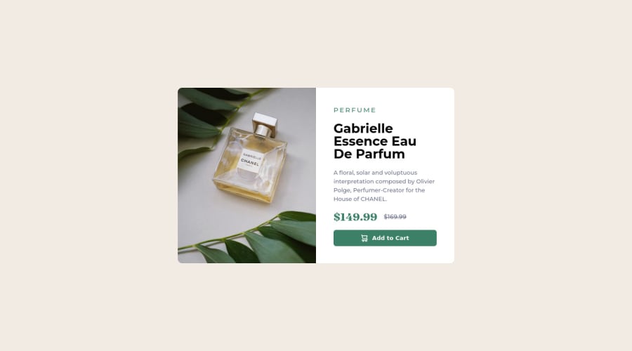


Design comparison

Solution retrospective
I found difficulties in keeping image and text part into equal ratio.
Community feedback
- @VincenzoMuoloPosted about 2 years ago
Hi, i'm new here but i would suggest you to take a deeper look at GRID and FLEX layouts.
Both provide properties to handle better the elements inside,
Grid for istance has grid-template-rows and grid-template-columns that allow you to set the number of row/column and their dimension. (That's what i used im my solution.)
Flex instead has flex-basis that allow you to give for every element a certain % off the total available space.
Both do the job, you have just to choose one first and try the various property he provides.
Hope to have been helpful, have a nice day!
0 - @CodeWithMohaiminPosted about 2 years ago
@khurshid-tech bro That's great project you did but, I find your project hasn't mobile responsive yet. Here my project take a look for mobile responsive idea.
https://www.frontendmentor.io/challenges/product-preview-card-component-GO7UmttRfa/hub/product-preview-card-completed-9MrkauT7dm
0


Please log in to post a comment
Log in with GitHub
Join our Discord community
Join thousands of Frontend Mentor community members taking the challenges, sharing resources, helping each other, and chatting about all things front-end!
Join our Discord