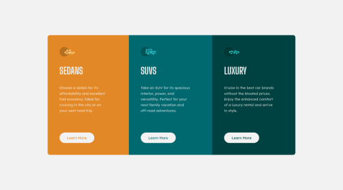
Not Found
Not Found
Not Found
Not Found
Not Found
Not Found
Not Found
Not Found
Not Found
Not Found
Not Found
Not Found
Not Found
Not Found
Not Found
Not Found
Not Found
Not Found
Not Found
Not Found

Submitted

3 Column Preview Card

Royβ€’ 600

@arkaroy135

Desktop design screenshot for the 3-column preview card component coding challenge

This is a solution for...

  • HTML
  • CSS
1newbie
View challenge

Design comparison


SolutionDesign

Solution retrospective


Feedbacks will be welcomed !!!

The project was finished within one hour. It is a great achievement for me.

One question for the community though, how to do it with grid instead of flex ?

Community feedback

suhayb jirdeβ€’ 1,050

@suhaybjirde

Posted

i did it with grid check it out i you need it❀

Marked as helpful

1
Travolgi πŸ•β€’ 31,420

@denielden

Posted

Hello Roy, You have done a good work! 😁

Some little tips to improve your code:

  • Tip of graphic design: with font-family:" Big Shoulders Display ", cursive the browser will use the Comics Sans font when it doesn't find the first font indicated (you can seen during loading)... for the designer it's a really awful font! I would rather replace it with a font-family:" Big Shoulders Display ", sans-serif much more similar to the primary font.
  • use min-height: 100vh to .container class instead of height, otherwise the content is cut off when the browser height is less than the content
  • add transition on the element with hover effect

Keep learning how to code with your amazing solutions to challenges.

Hope this help πŸ˜‰ and Happy coding!

Marked as helpful

1

Royβ€’ 600

@arkaroy135

Posted

@denielden I appreciate the tips. I will remember to use sans-serif as the backup font. And thanks for the min-height tip, it is most helpful. And as per transition effect, I forgot to include the hover effect in the project. Thank you for reminding me of that, and also thank you for your valuable feedback. Hope you will check my next projects too.

0
Travolgi πŸ•β€’ 31,420

@denielden

Posted

@arkaroy135 Sure! you are welcome and keep it up :)

0
Davidβ€’ 8,000

@DavidMorgade

Posted

Hello Roy! Great job finishing the challenge, for me it looks great on mobile and desktop sizes, nice.

To answer your question, you can easily archive the same result with grid, you won't need to use flex at mobile sizes, just grid at your 1280px media querie.

You can try it at your own doing this:

  1. In your .container .card remove the display: flex.
  2. In your 1280px mediaquery, add at your .container .card selector the property display: grid;
  3. Also add to your .container .card grid-template-columns: repeat(3, 1fr);

With these properties your layout at mobile sizes will stay the same (because those block elements stacks one on the other as they have display: block by default), and with the display: grid at 1280px you will have 3 columns of the same size (grid-template-columns: repeat(3,1fr))

Hope my answer helps you!

Marked as helpful

1

Royβ€’ 600

@arkaroy135

Posted

@DavidMorgade Thank you for the tips. I really appreciate those. I now understand how to use grid layout after reading your tips. Thank you very much for those and hope you will see some improvements in my codes. I will wait for your feedback on my next projects.

1
VincenzoMuoloβ€’ 180

@VincenzoMuolo

Posted

Hi there, the easier way to achieve that is (in my opinion) to do something like this.

Codepen sample

The sample is pretty raw but hope i gave you the idea of how to do it!

As you see the key is to use column-template-columns and column-template-rows.

Cheers

Marked as helpful

1

Royβ€’ 600

@arkaroy135

Posted

@Shirohige-96 Just checked your code for this project. Really love the dark mode. I will integrate that on my projects in the future.

0
VincenzoMuoloβ€’ 180

@VincenzoMuolo

Posted

@arkaroy135 Glad you like it!

0
suhayb jirdeβ€’ 1,050

@suhaybjirde

Posted

perfect you did well

0

Please log in to post a comment

Log in with GitHub
Discord logo

Join our Discord community

Join thousands of Frontend Mentor community members taking the challenges, sharing resources, helping each other, and chatting about all things front-end!

Join our Discord