Not Found
Not Found
Not Found
Not Found
Not Found
Not Found
Not Found
Not Found
Not Found
Not Found
Not Found
Not Found
Not Found
Not Found
Not Found
Not Found
Not Found
Not Found
Not Found
Not Found

All comments

  • @upovibe

    Submitted

    Testimonials grid section👨🏽‍💻

    Technologies used 🚀✨

    • HTML🏗
    • CSS️🎨

    Features 🎯

    • Semantic Arrangement✨
    • Dynamic Animations🎭
    • Prettier Arrangement🌈

    You can check me out

    Ready to tag along on my coding escapades? Join my adventure, where I challenge projects here.

    🌌 Feel free to add your opinion about any possible improvements to the code and accessibility. 🙃

    Naveen CB 420

    @Naveen-CB

    Posted

    Hello @iamupo, your solution looks good but I have notice one issue with you code.

    In your card-5 section you did some mistake that make it to overflow at some viewport width:

    @media (min-width: 1200px) {
      .card5 {
        grid-column: 4;
        grid-row: 1/4;
      }
    }
    

    Instead try this :

    @media (min-width: 1200px) {
      .card5 {
        grid-column: 4;
        grid-row: 1/3;
      }
    }
    

    Other than this your solution looks good and I especially like that 2 column for tablet size.

    I hope this might be helpful to you❤️

    0
  • @Yorhs-Malasquez

    Submitted

    ¿Qué te resultó difícil mientras construías el proyecto? al inicio como estructurar el HTML. ¿De qué áreas de tu código no estás seguro? los css ¿Tiene alguna pregunta sobre las mejores prácticas? si la comunidad pudiera ayudarme a realizar mejores prácticas, les agradecería.

    Naveen CB 420

    @Naveen-CB

    Posted

    Hello @Yorhs-Malasquez your solution looks good and I have some suggestion to improve your code that will make your upcoming project more easy.

    .bg-pattern-quotation
    {
      position: absolute;
      top: 2px;
      right: 48px;
      z-index: 0;
      height: 140px;
    }
    

    Instead of using position: absolute, try using this:

    .bg-pattern-quotation
    {
      background-img: url('images/bg-pattern-quotation.svg');
      background-position: top right 20%;
      background-repeat: no-repeat; 
    }
    

    Actually I too used position absolute, and then find out this would be more effective solution.

    I hope this might be helpful to you, Happy learning. ❤️

    Marked as helpful

    1
  • @SimatG

    Submitted

    • Are there other aspects you'd like to highlight or any general suggestions you'd like to provide?
    • How does the website look on various devices (computer, tablet, mobile)?
    • What is your initial impression of the website's design and layout?
    Naveen CB 420

    @Naveen-CB

    Posted

    Hello @SimatG, your solution looks Good and also simple

    But I have some tips to improve your coding skills

    In HTML📌

    1. Try to link your fonts in HTML, it always a best practice to improve loading time of the page on subsequent visit if the font is provided by the third party website.
    • If you want more control on your fonts then download the font file.

    In CSS📌

    1. It is always best practice to use rem or em, px is only recommended when the size is less than 10px.
    2. There is always only one <h1></h1> tag and it is directly impact web accessibility and SEO.

    I hope this might helpful to you, Happy coding.❤️

    Marked as helpful

    0
  • Naveen CB 420

    @Naveen-CB

    Posted

    Hello @aadithya1551 you actually did a great job.

    But here is the one issue you need to fix it

    in your .container add this to center your container.

    .container{
        display: flex;
        min-height: 100vh;
        align-item: center;
        justify-content: center;
    }
    

    and as always try to add <main></main> tag this definitly improve your web accessibility and SEO.

    Try this out to make your solution to looks perfect.

    I hope this might be helpful to you❤️, Keep it up this sprit.

    0
  • ha308ing 90

    @ha308ing

    Submitted

    What are you most proud of, and what would you do differently next time?

    I'm proud of implementing a valuable advice to use kind of subcomponents, that are specific to the component. Next time I'd wrote more useful readme.md

    What challenges did you encounter, and how did you overcome them?

    I submitted this challenge a while ago.

    And it took me some time to recover pre-commit linting with lefthook, so I had to switch from yarn to npm.

    Because yarn created .pnp. files (also typescript vscode integration), while I do not agree to tolerate anything more than package.lock

    What specific areas of your project would you like help with?

    How to achieve pixel-perfect layout from .jpg design file?

    When I use 1px x 1px grid with max zoom in the browser .jpg edges kinda blurry and I each position I try is wrong ='(

    Naveen CB 420

    @Naveen-CB

    Posted

    Hello @ha308ing, mostly this types of card layout are just used as news, article, aside or blog in a website so nothing wrong to creating a appropriate tag for each data but it is some level of overcomplication for small part in a web(actually not needed that much) .

    I hope it helpful for you❤️.

    Happy learning🚀.

    Marked as helpful

    1
  • Naveen CB 420

    @Naveen-CB

    Posted

    Hello @JPerez03, Your solution looks good and also code is perfect.

    But I see some issue with centering your main element

    📌Here what you can do to fix it

    • Always add min-height: 100vh to center your main so, that it centers perfectly.

    • And I also see that you are using vh unit for all sizing and also for font-size. This might be looking good for this solution but definitely make not responsive in the sense of big screen.

    -So it is best practice to use rem or em for units you can refer units here

    0
  • Naveen CB 420

    @Naveen-CB

    Posted

    Hello @ofaruqayo

    First of all let's speak about your solution, that is looking good and also matches close to the solution.

    But I have some suggestion that take your coding and upcoming project to next level.

    I have noticed four issue ** Two for CSS and Two for HTML.**

    About CSS📌

    1. you are not yet centered your container so try this to center it

                            .container{
                                  display: grid;
                                  min-height: 100vh;
                                  place-content: center;
                                   place-item: center;
      
    2. It always a best practice to use rem or em instead of using pixels except you only need just few pixels of white spacing.

    About HTML 📌

    1. Adding <main></main> is always improves SEO and also accessibility of web so try to include main to your code.

    2. Semantic HTML plays a major role so instead of writing <div class= "card item2"> try to use <article class="card item2"> and same for all other card items.

    Overall try to use simple and more accessible mark up.

    I hope this might be helpful to you❤️.

    0
  • Naveen CB 420

    @Naveen-CB

    Posted

    @mcsimple-net

    Hello Vladimir Kvachevski, Let us take your code to another level, by improving sematic HTML.

    I have seen there is some unnoticed issue with your HTML but that makes significant impact when scaled in big project:

    • Adding <main></main> tag to your html is crucial to improve readability and understandability of your code to both programmers and screen reader and it also plays a major part in SEO so adding main tag is always a best practice .

    • Secondly I have seen you used <ul></ul> tag in the profile section this makes the screen reader to read this as a list this is indirectly reduce the semantic structure of HTML instead use <div><div> tag to improve accessibility.

    Other than this your code and styling is looking perfect

    I hope this might be helpful to you ❤️.

    Marked as helpful

    0
  • Naveen CB 420

    @Naveen-CB

    Posted

    @ZioSenkai

    Zio your code looks good and also it resembles to the solution.

    But I saw some issue with your index.html:

    It is always best practice to add your styling in separate file that is style.css

    • It improves performance by making your website to load faster.
    • Secondly, The styling gets easy to access and read when you are working with multiple developers.

    Overall from the point of big projects it is best to use style.css

    Other than this your code looks Good

    I hope this might be helpful to you ❤️

    Marked as helpful

    1
  • Naveen CB 420

    @Naveen-CB

    Posted

    @therealmaduanusi hello my friend, your code looks simple and clean.

    But I think you probably not notice these small issues with your code:

    • Always make sure you have given some some relevant text in alt I have seen your alt tag is empty.
    • I also noticed you have imported font in CSS instead you can use @font-family because Frontend mentor actually provided font files directly.

    This small unnoticeable things can make a big difference.

    Other than this your code is looking code and for me I like your CSS styling❤️

    Marked as helpful

    0
  • Naveen CB 420

    @Naveen-CB

    Posted

    @Abhishek10351 Hello Abhishek, your code looks good and almost exact to the solution

    Here is my few suggestions to improve SEO and accessibility:

    • To improve your HTML avoid using div for everything instead Add the tag relevant to it.
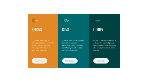
    • For example: instead of using div to suv, sedan, luxury you can add.
    • <h2>suv</h2> and same for next two sections.

    I hope it helps you to improve your HTML

    1
  • Naveen CB 420

    @Naveen-CB

    Posted

    Hello @ArafAfif your code almost accurate to the solution but here are some solution to improve your project further : - 1. mentioning font with font-size in em or rem is increase your text readability in all type of screens.- 2.Try to use source for different size of images for different screen ref here.-

        -I hope this might be useful to you.
    

    Marked as helpful

    0