


@bhp005Submitted 3 months ago
Latest solutions
Cards with 3 types of data and global toggler react, styled-components
#react#styled-components#vite#zustandSubmitted 3 months agostyled-components or tailwind?
Newsletter Signup Form Using React, Tailwind CSS
#react#tailwind-css#vite#typescriptSubmitted 3 months agoResponsive Grid Layout
#post-css#react#typescript#viteSubmitted 3 months agoI'd like to know how to get
box-shadowproperty value with just a single look at it 😉Four card feature section with gulp, pug, postcss
#gulpSubmitted 10 months agohow to get font properties like line-height and letter-spacing from screenshot?
Product preview card react component with vite, postcss
#react#viteSubmitted 10 months agohow to move (higher or lower) the crossing line of strikethrough text? 🤔
Latest comments
- @ha308ingPosted 3 months ago
to fix content overflow (the card is cropped), you could use:
body { justify-content: flex-start; }body { min-height: 100vh; }- do not limit height, but provide minimum desired valuebody { padding-block: 20vh }
Marked as helpful1 - @Benson0721Submitted 3 months agoWhat are you most proud of, and what would you do differently next time?
This practice helped me strengthen my understanding of React state and grid concepts. To be honest, the time I spent on it wasn't very long. So, I decided to add new features to this project! It looks nice, and completing the day/night pattern taught me a bit about color schemes.
What challenges did you encounter, and how did you overcome them?To implement new features, it’s essential to think differently than before. I spent some time figuring out a better way to control the entire page when I click the toggle. Using state to switch might be the best approach to address this issue.
What specific areas of your project would you like help with?A better way or point out mistakes of this project Thx~~
@ha308ingPosted 3 months agogreat solution!
nice transitions and theme switching! 👏
radio buttons for switching timeframes is another level!
0 - @SpecroSubmitted 4 months ago@ha308ingPosted 3 months ago
Great solution! Clean code structure! Well done! 👍
Take a look at the
pictureelement, it allows to use single image element, but with variablesrcattribute mdn<picture> <source srcSet="images/illustration-sign-up-desktop.svg" media="(width >= 768px)" /> <img src="images/illustration-sign-up-mobile.svg" alt="" /> </picture>Marked as helpful1 - @jonathan-eduardoSubmitted 3 months agoWhat are you most proud of, and what would you do differently next time?
In my opinion the result looks very similar to the design file so I'm happy with the solution
What challenges did you encounter, and how did you overcome them?As I'm not a Pro member, the difficult part is always trying to guess some properties and things that aren't in the design files (box-shadow, padding, margin, etc.)
What specific areas of your project would you like help with?I'm open to any feedback
@ha308ingPosted 3 months agoImpressive solution! Looks like perfect!
Great idea with code structure with all the challenges and a landing page! 👍
1 - @GentlestanSubmitted 3 months agoWhat are you most proud of, and what would you do differently next time?
I'm most proud of how I organized the code and used semantic HTML to create a clean and accessible layout. The use of custom fonts and the clear structure of the content, including sections for ingredients, instructions, and nutrition, really help in making the recipe page easy to follow and aesthetically pleasing
@ha308ingPosted 3 months agoNice solution!
Solution font and design font mismatch a bit, you could try to use
font-family: "Young Serif", serif;but notfont-styleproperty: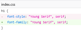
Also to match horizontal lines (
<hr>) color with the design, you could style then with css (and even width!):hr { color: #eee; }Marked as helpful0 - @MahdyrllSubmitted 4 months agoWhat challenges did you encounter, and how did you overcome them?
the share button was challenging because i didn't know how to handle it and how to write the javascript code and style base on the ui.
@ha308ingPosted 3 months agoNice solution!
I would recommend to not limit user section width, with reduced browser scale it shifts a bit:
HTML is very clean! 👍
Marked as helpful1


