
@bhp005

ha308ing
@ha308ingAll comments
- @ha308ing
to fix content overflow (the card is cropped), you could use:
body { justify-content: flex-start; }body { min-height: 100vh; }- do not limit height, but provide minimum desired valuebody { padding-block: 20vh }
Marked as helpful - @Benson0721What are you most proud of, and what would you do differently next time?
This practice helped me strengthen my understanding of React state and grid concepts. To be honest, the time I spent on it wasn't very long. So, I decided to add new features to this project! It looks nice, and completing the day/night pattern taught me a bit about color schemes.
What challenges did you encounter, and how did you overcome them?To implement new features, it’s essential to think differently than before. I spent some time figuring out a better way to control the entire page when I click the toggle. Using state to switch might be the best approach to address this issue.
What specific areas of your project would you like help with?A better way or point out mistakes of this project Thx~~
@ha308inggreat solution!
nice transitions and theme switching! 👏
radio buttons for switching timeframes is another level!
- @Specro@ha308ing
Great solution! Clean code structure! Well done! 👍
Take a look at the
pictureelement, it allows to use single image element, but with variablesrcattribute mdn<picture> <source srcSet="images/illustration-sign-up-desktop.svg" media="(width >= 768px)" /> <img src="images/illustration-sign-up-mobile.svg" alt="" /> </picture>Marked as helpful - @jonathan-eduardoWhat are you most proud of, and what would you do differently next time?
In my opinion the result looks very similar to the design file so I'm happy with the solution
What challenges did you encounter, and how did you overcome them?As I'm not a Pro member, the difficult part is always trying to guess some properties and things that aren't in the design files (box-shadow, padding, margin, etc.)
What specific areas of your project would you like help with?I'm open to any feedback
@ha308ingImpressive solution! Looks like perfect!
Great idea with code structure with all the challenges and a landing page! 👍
- @GentlestanWhat are you most proud of, and what would you do differently next time?
I'm most proud of how I organized the code and used semantic HTML to create a clean and accessible layout. The use of custom fonts and the clear structure of the content, including sections for ingredients, instructions, and nutrition, really help in making the recipe page easy to follow and aesthetically pleasing
@ha308ingNice solution!
Solution font and design font mismatch a bit, you could try to use
font-family: "Young Serif", serif;but notfont-styleproperty: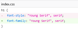
Also to match horizontal lines (
<hr>) color with the design, you could style then with css (and even width!):hr { color: #eee; }Marked as helpful - @MahdyrllWhat challenges did you encounter, and how did you overcome them?
the share button was challenging because i didn't know how to handle it and how to write the javascript code and style base on the ui.
@ha308ingNice solution!
I would recommend to not limit user section width, with reduced browser scale it shifts a bit:
HTML is very clean! 👍
Marked as helpful - @GuilhermeFigueira@ha308ing
Great text of the card header (preview) alignment!
It seems cards miss some shadows, but anyway the result looks great!
- @madjackyWhat are you most proud of, and what would you do differently next time?
modern css
What challenges did you encounter, and how did you overcome them?container queries
What specific areas of your project would you like help with?nothing
@ha308ingvery much cool! would be great to see the source code and not only the build output =)
- @VictorKevzWhat are you most proud of, and what would you do differently next time?
I am really happy that I am now paying close attention to design details! I believe I was able to get my solution very close to the original design. I experimented with both mobile-first and desktop-first approaches and still achieved the desired result! So I am glad that I am finally understanding responsiveness, but I also know that I still have a lot to explore and enhance my skills. 💪🏽
What challenges did you encounter, and how did you overcome them?None
What specific areas of your project would you like help with?Any feedback on how I can improve is welcome.🤗
@ha308ingvery close to the design file 👍
you can use picture and source elements to not to load 2 images for mobile and desktop, but only one relevant image. take a look: web.dev link
- @mircodgWhat are you most proud of, and what would you do differently next time?
.
What challenges did you encounter, and how did you overcome them?Never used table before and the styling isn't the best still.
What specific areas of your project would you like help with?Any feedback is appreciated.
@ha308ingcongrats on completing the challenge!
let me suggest you some tools to align elements with design image:
- Pixel Glass places design image at the background with variable opacity
- PixelParallel extension for chromium's
Marked as helpful - @bialasssekWhat are you most proud of, and what would you do differently next time?
it was pretty straight forward
What challenges did you encounter, and how did you overcome them?mostly the space bc i dont want to do that with margins so i did it with gap it is easier to change later
What specific areas of your project would you like help with?.
@ha308ingNice design!
I really like your css variables! 👍
If to use links as anchors
<a>, I think you'll get free keyboard navigation, also I saw a recommendation, to use<ul>and<li>for such list of items. - @muhaiminultasinWhat are you most proud of, and what would you do differently next time?
this my first project of frontend mentor. I'm so happy for making the solution.
What challenges did you encounter, and how did you overcome them?there was no challenge in this project.
What specific areas of your project would you like help with?the text area.
@ha308ingNice photo you have there! =)
I don't know, but hope it'll be useful: on a challenge page there is a link to an archive with assets and some helpful md files, like style-guide, with exact colors from the design
- @rckashWhat are you most proud of, and what would you do differently next time?
I am proud to have built this project after learning how to properly use CSS units. This is my best work so far and I can't improve on it yet.
What challenges did you encounter, and how did you overcome them?I did not know how to apply proper margins and paddings, I could not center the card as well. I searched YouTube for helpful tutorials until I stumbled upon Kevin Powell's channel.
What specific areas of your project would you like help with?I do not need help as I have figured it out with the help of online resources. This is a simple project as well.
@ha308ingnice work!
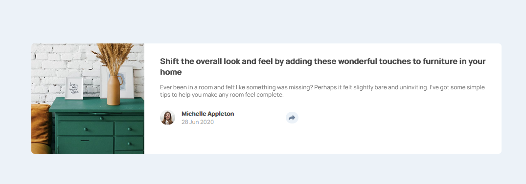
solution screenshot has extra strings, but live solution as by design.
if to look closely there is a shadow under the card, to add shadow
box-shadowcss property is used (syntax:box-shadow: <x> <y> <blur> <spread> <color>), like:.my-card { box-shadow: 0 25px 25px 0 rgba(0, 0, 0, 4.77%); }


