Not Found
Not Found
Not Found
Not Found
Not Found
Not Found
Not Found
Not Found
Not Found
Not Found
Not Found
Not Found
Not Found
Not Found
Not Found
Not Found
Not Found
Not Found
Not Found
Not Found

All comments

  • @Ablueremote

    Submitted

    My understanding of flexbox and grid is starting to come along but can use some analogies to help solidy the knowledge. I think I overused code so any pointers are helpful. Ive spent 3 days building this and became a little frustrated just not knowing how to place and frame my elements and sizing.

    All tips appreciated

    Maksim 590

    @MaxTarasevich

    Posted

    The max-width property sets the maximum width of the container.

    In this case, if you remove the width value from the product-card block, then its width will be calculated automatically by the browser, depending on the content.

    Try this code for image:

    .chanel-photo {
        object-fit: cover;
        max-width: 100%;
        height: 100%;
    }
    

    Image is inline element and so you have to specify its width and height in css to always get the expected result. Read this article on mozilla about images

    Marked as helpful

    0
  • @Ablueremote

    Submitted

    My understanding of flexbox and grid is starting to come along but can use some analogies to help solidy the knowledge. I think I overused code so any pointers are helpful. Ive spent 3 days building this and became a little frustrated just not knowing how to place and frame my elements and sizing.

    All tips appreciated

    Maksim 590

    @MaxTarasevich

    Posted

    Hello, Antonio!

    Good job! But there is still work to be done!

    The product-card block needs to be given a maximum width, in order to round the corners use the properties:

         border-radius: 10px
         overflow: hidden;
    

    If you find it difficult to deal with flexbox, I advise you to play with this game!.

    And of course MDN! - This is the best resource!

    Next, the card image needs a container to enclose it, and with the object-fit : cover property, you can stretch it across the parent box without losing proportion!

    I hope my feedback will help you!

    Marked as helpful

    0
  • @sqirum

    Submitted

    Hey guys, second exercise using tailwind and I'm quite enjoying this library, if you have any tips or advices are welcome. Happy coding to everyone.

    Maksim 590

    @MaxTarasevich

    Posted

    Hello! Congratulations on completing the challenge!

    I think you should pay more attention to the correspondence of your design to the original layout! In particular, the differences in indentation and different font sizes in the heading are striking. Also a background image, with it this layout looks much more fun!

    Tailwind has built-in animations, why not use them for hover effects like icons!? That would be great!

    On a screen resolution of 1440px and up to 1024px, you have almost no padding to the left and right of the content, the icons and the picture are pressed to the edge of the screen.

    I hope my feedback helps you!

    Marked as helpful

    0
  • Maksim 590

    @MaxTarasevich

    Posted

    Hi Anthony!

    You can easily solve your problem by setting the property background-color as rgba(0, 255, 247, 0.65);.

    The opacity property when hovering over the .Card Image _wrapper block should be 1, respectively.

    .Card_image__wrapper__MClPi:hover .Card_overlay__3i7Lc {
        opacity: 1.0;
    }
    

    You can't make the value of the opacity property of a child element greater than that of the parent element. Less - you can, no more!

    Also add a display: block property to the image, as it has a smaller height than the parent, and it's noticeable on hover!

    .Card_image__sWcC9 {
        display: block;
    }
    

    I hope my feedback was helpful!

    Marked as helpful

    1
  • @Nico-2b

    Submitted

    Hi! This is my version of the Space Tourism Website! I hope you'll like it. It's a single page application that uses Javascript to display the others pages with cool animations. The website is completely responsive. Enjoy!

    Maksim 590

    @MaxTarasevich

    Posted

    Hi Nicolas!

    Great job! The animations look great! Especially on the CREW page.

    Add a background color for the body - dark, due to the fact that the default body has a white background, and it takes time to load background pictures - a characteristic flashing appears, not very pleasing to the eye!

    It's great that you decided to build your pages dynamically with JavaScript!

    But, you have a lot of repetition in the code, for example: you create an element, assign a class to it, insert text content, and so many, many times!

    Try to create a function that will do this! For example:

    function createElement (el = 'div', className='',text=''){
      let element = document.createElement(el)
      element.classList.add(className)
      element.innerText = text
      return element
    }
    

    Then you can call this function as much as you like, creating the elements you need

       const main = createElement('main')
          const h3 = createElement('h3', 'title', ' title text')
          const strong = createElement('strong', 'classForStrong', 'text')
    

    I hope my feedback was helpful!

    Marked as helpful

    0
  • @BMcdavitt

    Submitted

    I enjoyed this one. I had a bit of trouble getting the image to display appropriately in all screen resolutions, I essentially added an extra @media query just to make sure the image displayed close to correctly between mobile and full desktop. I'll be looking forward to see how others accomplished this.

    Maksim 590

    @MaxTarasevich

    Posted

    Hi Bill!

    Good job!

    I think you need to work on some more styling to get your layout closer to the original!

    In particular, the cardContent block needs padding at the top and bottom, the heading and paragraph blocks - the text in them is centered, but must be left-aligned, and the width of these blocks must be limited, use the max-width property.

    At screen resolutions between 900px and 750px, your Stats preview card is pressed against the left edge of the screen.

    I hope my feedback was helpful!

    Marked as helpful

    0
  • Maksim 590

    @MaxTarasevich

    Posted

    Hi!

    Good job!

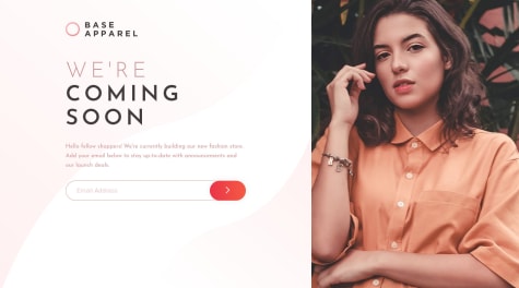
    Note that your layout breaks on screen resolutions between 1000px and 601px . The photograph of the girl becomes very narrow.

    I think it's unfair to such beauty!

    On the screen resolution from 600px to 518px there is an indent on the right!

    To fix this, you should pay attention to the width , padding , margin values for the following blocks:

    .container, content-left, content-inner, bg-mobile!

    Try to simplify your layout as much as possible, a large number of wrapper blocks can sometimes be very confusing.

    I hope my feedback was helpful!

    Marked as helpful

    1
  • Maksim 590

    @MaxTarasevich

    Posted

    Hi!

    Good work!

    But You should still work on field validation!

    CARDHOLDER NAME - I can fill in completely numeric values.

    EXP. DATE (MM/YY), CVC - need to be checked for data correctness and string length.

    It is also worth fixing the mobile version, at a screen resolution of less than 450 the design layout breaks!

    Also you forgot to delete in the App component console.log:

    const onSubmit = (data, e) => console.log(data, e)
     const onError = (errors, e) => console.log(errors, e);
    

    You have all the application code in the App component, the application is small, but it’s still worth breaking it into components. You have five states, try representing the data as an object!

    I hope my feedback will be helpful!

    Marked as helpful

    0
  • Maksim 590

    @MaxTarasevich

    Posted

    Hello!

    Great job!

    Pay attention!

    Since this is a product card, the image here is an important part of the content, in this case, you should not insert it using CSS properties. It's better to use the img tag and don't forget about the alt attribute.

    Here you can briefly review when to use tag and when to use CSS properties for images!

    I hope my feedback was helpful to you!

    Marked as helpful

    0
  • Maksim 590

    @MaxTarasevich

    Posted

    Hello! Good job!

    Please note that on the panel with sorting buttons, the "All" button is always highlighted, regardless of the user's choice, and the filtering itself works correctly, it's a little confusing!

    You should also improve the design on a screen resolution of 800px or less - the TODO input fields are too small, and there is a lot of space on the sides!

    I hope my feedback was helpful!

    Marked as helpful

    0
  • Rian 70

    @AdhaRian

    Submitted

    Hey Guys, This is my solution for this challenge.

    I find it difficult making the image hover and unsure if the code is right.

    Any feedback for the this code would be appreciated

    Maksim 590

    @MaxTarasevich

    Posted

    Hi Rian!

    Good job!

    Pay attention to the following points:

    In order to center the .card block, you made the body flex container as well as the .container block. I think this is a bit redundant, try to remove the flex properties from these blocks, as well as the properties

    max-width: 30%; height: auto;

    height: auto; is the default property and max-width: 30%; will greatly compress your card at low screen resolutions, and vice versa at high resolutions - greatly stretch it.

    It is enough to set the width for the .card block and give it a property margin: auto; the block will be centered. Or, instead of margin, return the flex properties to the body tag.

    For block .overlay properties

    width: 100% 
     height: 98.5%;
    

    superfluous, just set

       top: 0; 
       left: 0; 
        bottom: 0; 
        right: 0;
    

    or in the shorthand

    inset: 0; 
    

    and the block will take the entire width and height. In order for the image to match the parent block, add the property display: block;

    I hope my feedback will be useful to you!

    1
  • Maksim 590

    @MaxTarasevich

    Posted

    Hi Ahmed!

    You've done a great job!

    But there are many more points that require your attention in this task!

    1.Please, add alt atribute for cards images, it is very important!

    2.Try to write css in the same style, indent put spaces and indent, for example:

    this code is very hard to read

    *{margin: 0;
    padding: 0;}
    body{width: 100%;
    box-sizing: border-box;
    color: var(--light_txt);
    background-color: var(--light_background);
    font-family: Nunito Sans;}
    

    this code is easy to read

    * {
      margin: 0;
      padding: 0;
    }
    
    body {
      width: 100%;
      box-sizing: border-box;
      color: var(--light_txt);
      background-color: var(--light_background);
      font-family: Nunito Sans;
    }
    

    This is important, because some time later, when you want to rewrite your code, it will be easier for you to understand it!

    3.Seach and filter not working!Try to improve your JS code, break it into several small functions, each of which performs its own, one task! For example - one function receives country data, another function creates HTML markup, and so on.

    I hope my tips help you!

    1