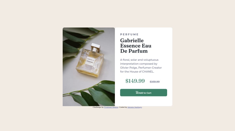
@MaxTarasevich
Posted
The max-width property sets the maximum width of the container.
In this case, if you remove the width value from the product-card block, then its width will be calculated automatically by the browser, depending on the content.
Try this code for image:
.chanel-photo {
object-fit: cover;
max-width: 100%;
height: 100%;
}
Image is inline element and so you have to specify its width and height in css to always get the expected result. Read this article on mozilla about images
Marked as helpful
@Ablueremote
Posted
@MaxTarasevich so i think I kind of understand making the container a size than fitting the img to the container. Now theres a issue with the mobile sizing just on the image. Can you take a look ? I tried stretching/fill to container and no luck
@MaxTarasevich
Posted
@Ablueremote pay attention, you are provided with several images - a mobile version and a desktop one.
With a screen resolution of 576px, you have limited the maximum height of the img-container block, 15rem = 240px , the original image size is 600/900, the browser tries to keep the aspect ratio of the image, taking into account these parameters, as a result, an image of 160/240 format is displayed. If you remove the max-height property : 15rem; you will see that the image according to the property max-width: 100%; limited by the width of its container, but at the same time took all the necessary height to maintain the original proportions.
What is the best thing to do in this situation?
In my experience:
1.If possible, use the mobile version of the image
2.Set the image's width and height properties so that the browser doesn't have to deal with it on its own.
3.Use properties object-fit: cover; and object-position to maintain aspect ratio and display the image correctly.
I advise you to read this article about responsive images.
In general, working with images is perhaps the most difficult part when learning HTML, CSS, there are many nuances that need to be tested in practice!
Hope my tips help you!