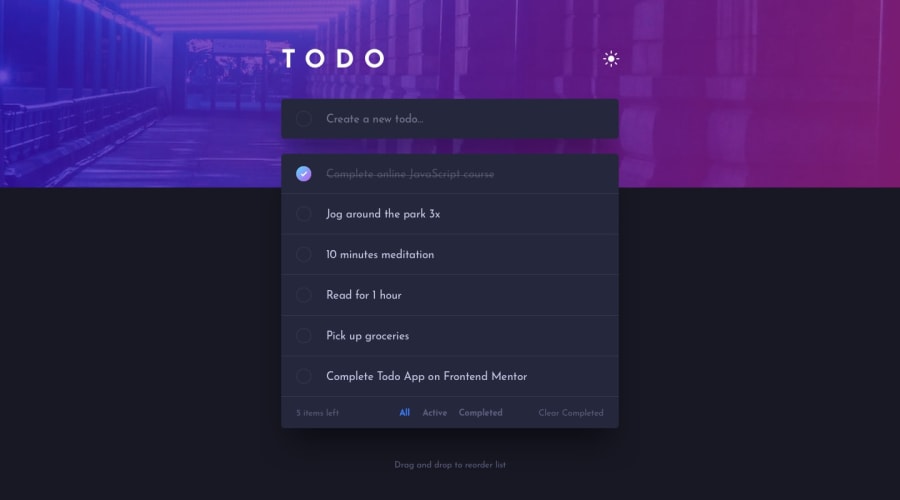
Submitted about 2 years ago
ReactJS, Tailwind CSS, Heruko, JSON server, NodeJS
@AbdElrahmanGbr
Design comparison
SolutionDesign
Community feedback
- @MaxTarasevichPosted about 2 years ago
Hello! Good job!
Please note that on the panel with sorting buttons, the "All" button is always highlighted, regardless of the user's choice, and the filtering itself works correctly, it's a little confusing!
You should also improve the design on a screen resolution of 800px or less - the TODO input fields are too small, and there is a lot of space on the sides!
I hope my feedback was helpful!
Marked as helpful0
Please log in to post a comment
Log in with GitHubJoin our Discord community
Join thousands of Frontend Mentor community members taking the challenges, sharing resources, helping each other, and chatting about all things front-end!
Join our Discord
