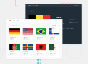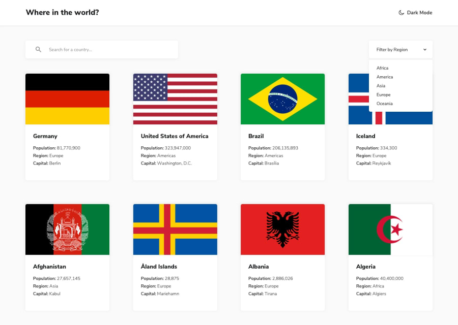
Design comparison
Solution retrospective
check my clean code
Community feedback
- @MaxTarasevichPosted about 2 years ago
Hi Ahmed!
You've done a great job!
But there are many more points that require your attention in this task!
1.Please, add alt atribute for cards images, it is very important!
2.Try to write css in the same style, indent put spaces and indent, for example:
this code is very hard to read
*{margin: 0;
padding: 0;}
body{width: 100%;
box-sizing: border-box;
color: var(--light_txt);
background-color: var(--light_background);
font-family: Nunito Sans;}
this code is easy to read
* {
  margin: 0;
  padding: 0;
}

body {
  width: 100%;
  box-sizing: border-box;
  color: var(--light_txt);
  background-color: var(--light_background);
  font-family: Nunito Sans;
}
This is important, because some time later, when you want to rewrite your code, it will be easier for you to understand it!
3.Seach and filter not working!Try to improve your JS code, break it into several small functions, each of which performs its own, one task! For example - one function receives country data, another function creates HTML markup, and so on.
I hope my tips help you!
1@ahmedsoumri01Posted about 2 years ago@MaxTarasevich in the search the first letter of country nae must be a capital lettre thats why he didin't work with you. filter is working i test it thanks
0
Please log in to post a comment
Log in with GitHubJoin our Discord community
Join thousands of Frontend Mentor community members taking the challenges, sharing resources, helping each other, and chatting about all things front-end!
Join our Discord
