Mohamed Fathy
@M0hamedFAll comments
- @EshoJinaduSubmitted almost 3 years ago@M0hamedFPosted almost 3 years ago
Go To
- Project`s Settings
- Pages
- Change Branch to Main
- Change Select Folder To ** /(Root)** It takes sometime to start, try it 👍 .
1 - @henmachucaSubmitted almost 3 years ago@M0hamedFPosted almost 3 years ago
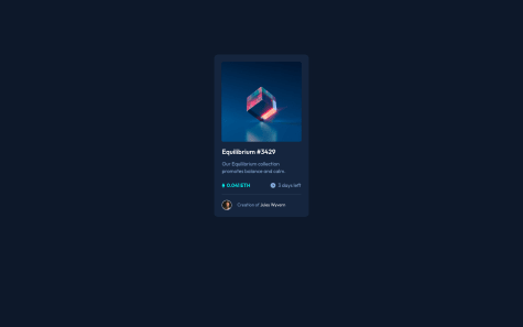
Hi Henrique
  height: 100vh;
  display: grid;
  place-items: center;
  margin: 0;
  background-color: hsl(217, 54%, 11%);
}

main{
  background-color: hsl(216, 50%, 16%);
  /* width: 18%; */ width: 250px;
  border-radius: 10px;
  /* margin: 150px auto; */
  padding-top: 20px;
}```
 I changed these 2 parts in your code try it now
i replaced margin: 150px auto;``` with   height: 100vh;
  display: grid;
  place-items: center;
1 - @EshoJinaduSubmitted almost 3 years ago@M0hamedFPosted almost 3 years ago
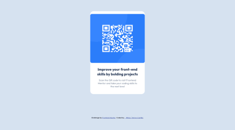
Hi Esho-Jinadu I think you should change QR-code.html to index.html.
0 - @henmachucaSubmitted almost 3 years ago@M0hamedFPosted almost 3 years ago
Hi Henrique Great job 🎉. I will suggest a few adjustments
- To center the card better use
height: 100vh; display: grid; place-items: center;in the body instead ofmargin: 150px auto;For more info about Grid 1- w3schools. 2- MDN Web Docs. - Use a px width instead of the % in the
main - Use
cursor: pointer;in ```:hover`` to change the cursor Keep the good work 👍👍👍
1 - To center the card better use
- @devsimocastlesSubmitted almost 3 years ago
It was easy, but I feel I can do it better, any recomendation?
pd: I don't know why the qr code looks broken in the design preview, works well in live url
@M0hamedFPosted almost 3 years agoHi RIkka Greed job 🎉 I will suggest
- adding
<main></main>as a container to your card and attribution. - Removing unnecessary space to keep it clean
- You can center the card with
display: grid; place-items: center;instead ofjustify-items: center; align-items: center;Keep the good work 👍
Marked as helpful1 - adding
- @Nightcode16Submitted almost 3 years ago
I completed another challenge😁. Any suggestion is very welcome😂.
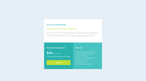
@M0hamedFPosted almost 3 years agoGreat job 🎉 you made it look nearly perfect to the preview. You can make the transition smoother by adding "transition: 0.3s; or what suits you in sec " by adding it in 1- ".hover:hover" will make it change smoothly to the color. 2- ".hover" will change it back. For more info: (https://www.w3schools.com/css/css3_transitions.asp) (https://developer.mozilla.org/en-US/docs/Web/CSS/CSS_Transitions/Using_CSS_transitions) Keep up the good work👍!
Marked as helpful0 - @The-Fat-CatSubmitted almost 3 years ago
Hi guys! I'm a fairly new coder and wanted to get feedback on my code. Something I struggled with was margin and padding properties. I found that for the most part I was doing guesswork to position my image using the dimensions of the screen. I also wanted to see if there's ways I can make my code smaller and cleaner (i.e achieving the same results using less code). Additional question regarding the position property. I noticed that another way to position my elements were setting the position property to absolute and defining the margins but that wasn't ideal for responsive websites (ex if you resize the window) so if anyone could give me tips on what scenarios the property values are best used for that would be amazing! :)
@M0hamedFPosted almost 3 years agoHi Gretel Rodriguez Congrats on your first project 🎉, 1- I would suggest to separate CSS from HTML , by creating new file called style.css and connect it to your HTML
2- The best way to center your dev is using grid "as far as I know". you can use (display: grid; /place-items: center;) to center the card in the middle of the screen For info in details: (https://developer.mozilla.org/en-US/docs/Web/CSS/CSS_Grid_Layout) Or (https://www.w3schools.com/css/css_grid.asp) Keep the good work👍
Marked as helpful0 - @louisenorrsenSubmitted almost 3 years ago
Please give feedback! What did I do good and how can I make it even better?
@M0hamedFPosted almost 3 years agoGreat job 👍 you made it look nearly perfect to the preview. You can make the transition smoother by adding "transition: 0.3s; or what suits you in sec " by adding it in 1- ".hover:hover" will make it change smoothly to the color. 2- ".hover" will change it back. For more info click on the link "https://www.w3schools.com/css/css3_transitions.asp" Keep up the good work!
Marked as helpful0 - @Qstar12Submitted almost 3 years ago
Hi!
I'm interested in your feedback as well as your mentorship. Feel free to add value to my growth and overall understanding. It will be greatly appreciated.
@M0hamedFPosted almost 3 years agoHi @Qstar12 There is an option in the inspect called lighthouse it will tell you your accessibility issues before submitting it here. https://developers.google.com/web/tools/lighthouse#get-started Keep the good work 👍
Marked as helpful1


