Design comparison
Solution retrospective
Hi!
I'm interested in your feedback as well as your mentorship. Feel free to add value to my growth and overall understanding. It will be greatly appreciated.
Community feedback
- @M0hamedFPosted almost 3 years ago
Hi @Qstar12 There is an option in the inspect called lighthouse it will tell you your accessibility issues before submitting it here. https://developers.google.com/web/tools/lighthouse#get-started Keep the good work 👍
Marked as helpful1@Qstar12Posted almost 3 years ago@M0hamedF thanks for sharing your inspection options it will help as I continue to learn. Thanks for your feedback.
0 - @BurakOzcancfPosted almost 3 years ago
Hi @Qstar12!
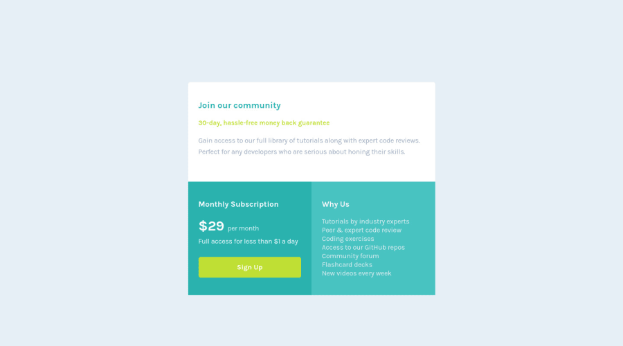
Firstly great job 👏🏻 it almost look the same however you can add box-shadow and border radius. And also you have bunch of accessibility issues. To get rid of them you can put li into the ul. Because li is a list item so you should write into the list. Not into the div.
Marked as helpful0@Qstar12Posted almost 3 years ago@BurakOzcancf thanks! I wasn't sure which direction to go. As time progresses I will look back at these errors and appreciate them more as I continue to grow.
0
Please log in to post a comment
Log in with GitHubJoin our Discord community
Join thousands of Frontend Mentor community members taking the challenges, sharing resources, helping each other, and chatting about all things front-end!
Join our Discord